 Eric Portis
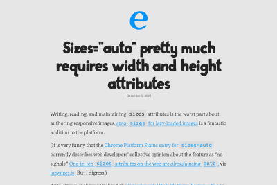
Sizes="auto" pretty much requires width and height attributes
sizes="auto" is a great new feature of HTML for lazy loaded responsive images. are we dealing with an with sizes=auto? Then its natural dimensions…
There are 62 contents with this tag:
Sizes="auto" pretty much requires width and height attributes
sizes="auto" is a great new feature of HTML for lazy loaded responsive images. are we dealing with an with sizes=auto? Then its natural dimensions…
Kuba Bartwicki and Monica Crusellas
A bold new look for the GOV.UK homepage
we’ve made the design of the homepage bolder and clearer on mobile devices. We redesigned the header area and increased font sizes and spacing throughout…
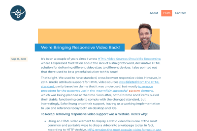
We're Bringing Responsive Video Back!
Responsive videos with simple HTML and no JS! 😍 Hopefully, this patch will show up in an upcoming Firefox release! 🤞
Educational Sensational Inspirational Foundational
A historical record of foundational web development blog posts. I've already read most of these great articles, and will of course read the few missing.…

The ideal viewport doesn’t exist
you simply do not know how users are going to visit your website or web app. Instead of making design decisions on strict, limited breakpoints, keep…
New Recommendations for Ecommerce Images
For ecommerce companies—particularly for those selling apparel—it likely makes sense to prioritize image quality above file size. This is a really…
The media attribute is back into the spec for <video>'s <source>! 🥳
https://github.com/whatwg/html/pull/9341
Let's hope srcset and sizes come next, but this needs a new issue:
https://github.com/whatwg/html/issues/6363#issuecomment-1564464346
I really like to see that all browser vendors agree with @scottjehl@mstdn.social that we need @media, srcset and sizes for <video> as for <img>/<picture>! 🤩
Do you know good tutorials and/or examples about dealing with responsive images that are fluid horizontaly, but with a fixed height?
Using object-fit: cover; in the CSS is easy, but how can we prevent loading many pixels that will be hidden, without using too many <source> in a <picture>?
I wonder why there are not so many Web games using mostly HTML, CSS and #SVG for the UI, with all the #responsive power they have… 🤷♂️
This live demo is more than 6 years old: https://play.esviji.com/wow/
(Remove wow at the end to really play… 😅)
Responsive Logo Composition With SVG
This is not a recent article, but it's still very useful, I should have shared it earlier! Logos are an ideal use-case for SVG. […] But what if we…
Responsive images on Shopify with Liquid
We launched the image_tag and image_url filters to help with generating responsive images. Before we dive in, what do these filters do? What are…
TIL @media not (min-width: 60rem) { … } doesn't work in Safari, while it works in Chromium and Firefox.
Safari requires a media type, like all.
So here's the "right" syntax:
@media not all and (min-width: 60rem) { … }
we hope that our observations and support will help bring JPEG XL support to the web for all chrome users
— @colinbendell from Shopify
https://bugs.chromium.org/p/chromium/issues/detail?id=1178058#c79
YES, please! 🙏
How do you deal with images that need to have a fluid width but fixed height?
I tend to start from the lowest width/height ratio and increase, knowing larger images will have hidden parts above and below… 😔
Anything better?
I accidentally moved my hero image onto Cloudinary (who I also adore!). But, a less-optimised image served from the same origin is always faster than a more-optimised image from a third party. Self-host your static assets! csswizardry.com/2019/05/self-host-your-static-assets/
True!
But most images are currently not or badly optimized. 😔
They would benefit a lot from an image CDN: resize, compression, modern formats, etc.
HTTP Archive
Media chapter of the 2022 Web Almanac by HTTP Archive
I had the honor to review the Media chapter of the 2022 edition of The Web Almanac by HTTP Archive, "a comprehensive report on the state of the web,…
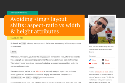
Avoiding <img> layout shifts: aspect-ratio vs width & height attributes
Layout shifts are a real annoyance on most sites, so please, read this new gem from Jake, about preventing images layouut shifts the right way… or…
Be careful if you use Chrome's device emulation to test responsive images, there's a bug on DPR emulation!
Star the issue!
Is there any public data about most common viewport widths and screen densities on the Web?
I have screen resolutions on StatCounter — good enough proxy for viewports? —, but nothing for screen densities… 🤨
📢 The 3rd Edition of EVERY LAYOUT is now available!
We were blown away reading all the kind words you gave us for testimonials; have some logical properties as a thank you!
every-layout.devN
Don't have this masterpiece yet? Get it now, it will prevent headaches when creating CSS layouts!
The layout of my #Eleventy project https://pack11ty.dev/ uses it to get a responsive layout without any media query.
Year 2022: the year of container queries
Also 2022: most people still don't understand srcset-w/sizes
How will they mix? They currently can't, as @SaraSoueidan explained: https://www.sarasoueidan.com/blog/component-level-art-direction-with-container-queries-and-picture/
Any other resource on the topic?
I started updating my photography site with new Media Queries and CSS environment variables to make sure Surface Duo owners enjoy it even more! 🎉
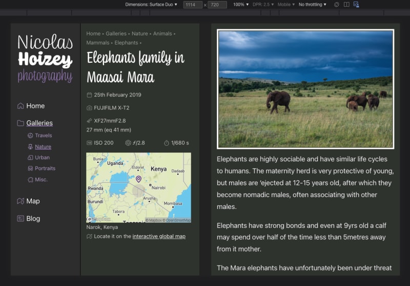
Other foldable devices will come if it makes sense.
You have a Surface Duo? Feedback is welcome! 🙏
Looks like @archdigestindia could improve #WebPerf for their readers and reduce bandwidth invoices…
564.5px widesizes says the image is full width414 % bigger
I'm happy to announce that @mavaddat will now help maintain and improve jekyll-cloudinary, my plugin to use #Cloudinary for responsive images in sites built with #Jekyll: https://nhoizey.github.io/jekyll-cloudinary/
eleventy-plugin-images-responsiver, my #Eleventy plugin for responsive images, is now available in a much faster v1.9.0! 🏎
My own site build is for example 30 % faster. 😍
This migration from basicHTML to LinkeDOM in images-responsiver looks good! 😍
I have yet to find if this behavior with HTML entities is an issue.
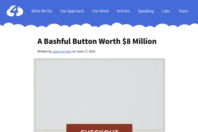
A Bashful Button Worth 8 Million Dollars
6 years ago I reported a bug about 100vh being larger than the viewport height in Safari. It was "intentional" according to webkit/Safari team, and…
Maarten Van Hoof
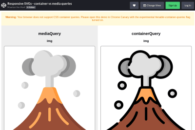
Responsive SVGs - container vs media queries
Maarten shows here (only in Chrome Canary for now) how container queries will allow us to have responsive SVG images inline in the HTML. Responsive…
4329 is a long discussion about how people are really, really, REALLY unhappy how on mobile the viewport units don't represent the size of the viewport — @fantasai https://github.com/w3c/csswg-drafts/issues/4329#issuecomment-814281379
😅
6 years later, this is still my most read article…
I bet I can find 10 different ways people handle responsive images in Markdown, for example in #Eleventy projects… I'm part of the problem. 😅
Shouldn't we try to first list requirements, and then maybe find a single solution for everyone, if possible?
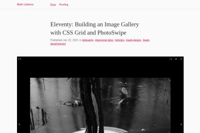
Eleventy: Building an Image Gallery with CSS Grid and PhotoSwipe
Mark is using my Images Responsiver plugin for Eleventy with Netlify Large Media and PhotoSwipe to build an image gallery, and it's really great!
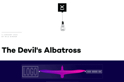
Nils Binder
A new nice responsive layout trick built upon Heydon Pickering's Flexbox Holy Albatross.

Xiao Zhuo Jia
So there it is, 5 different variations of fully accessible, CSS only mobile menu. I might have overdone it, but it was fun.
I mixed this awesome #Netlify proxy for #Cloudinary trick from @philhawksworth and @tkadlec with #Eleventy and my responsive images plugin, and the result is great! 😍
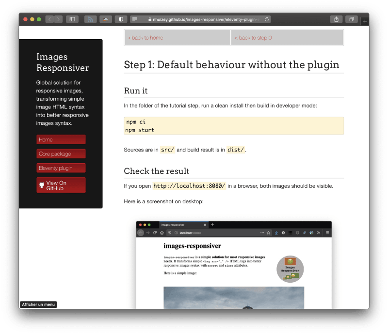
Each step of eleventy-plugin-images-responsiver tutorial is both a README and a small Eleventy site with the plugin and progressively improving configuration and usage… 😎
⚠️ People using my #Eleventy plugin for responsive images should be aware that its Git(Hub) repository has moved into the new images-responsiver monorepo.
There's nothing to do if it has been installed from npm, though.
Matt Anderson
as the device landscape continues to converge, the categorizations will continue to blur. And as you introduce more interactivity and complex features…
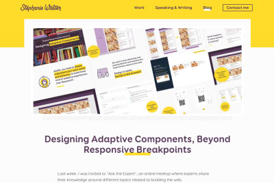
Stéphanie Walter
Designing Adaptive Components, Beyond Responsive Breakpoints
A great talk from Stéphanie about responsible use of responsive components: In the talk, I show how I design systems of components that go beyond…
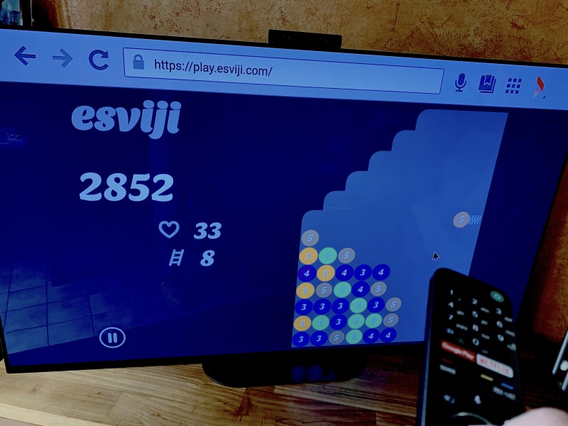
Would you play @esviji on your TV/console if d-pad/gamepad were supported?
I should "adapt to input" as @grigs told us on @alistapart: https://alistapart.com/article/adapting-to-input/
Play and tell me: https://play.esviji.com/
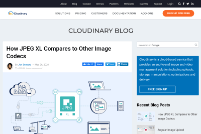
Jon Sneyers
How JPEG XL Compares to Other Image Codecs
With many competing image formats available, it's not always easy to know which one(s) we have to use to provide both the best performance and visual…
Responsive web design turns ten
I remember being really excited when I read Ethan's Responsive Web Design article on A List Apart and saw the final responsive result. 10 years later,…
images-responsiveris a simple solution for most responsive images needs
Is it catchy enough? 😁
Here's my latest pet project, trying to help people struggling with responsive images: https://nhoizey.github.io/images-responsiver/
If you use #Eleventy, there's also a plugin: https://github.com/nhoizey/eleventy-plugin-images-responsiver
Documentation is still a little rough around the edges, but should be enough at least for people already knowing npm and JS.
The Flexbox Holy Albatross Reincarnated
when you have three items, you’ll be happy with the three-abreast layout and accepting of the single-column configuration. But you might like to avoid…
great news: there are two on-the-horizion web platform features that are trying to make no-jank, fixed-aspect-ratio, fluid-width images a natural…
I generally avoid terms like “mobile”, “tablet”, and “desktop” in my work. It’s not that they’re bad; it’s because they’re broad. In my experience,…
Optimiser la performance des images responsives
J'ai eu l'honneur de présenter une petite conférence lors du meetup WebPerf de mars 2018, sur un sujet qui me passionne, puisqu'il combine deux de mes marottes en Web front : la WebPerf et les images en Responsive Web Design. Je vous invite à découvrir mes slides et la vidéo.
Cloudinary fait la promotion de mon plugin Jekyll
Je vous en avais parlé lors de ma migration vers Jekyll 3, je me suis lancé dans le développement d'un plugin Jekyll pour utiliser le service Cloudinary pour mes images responsives.
Voulez-vous une conférence sur les images responsive à ConFoo ?
J'ai proposé pour la première fois un sujet à la conférence canadienne ConFoo de février 2016. Le sujet correspond bien évidemment à une de mes passions…
Mettez à jour votre Picturefill !
Si vous êtes un peu à jour dans vos développements responsives, vous avez adopté le dernier standard pour les images —srcset, sizes et éventuellement…
esviji v2 sera complètement responsive
Voilà plus d'un an que je travaille sur une nouvelle version de mon jeu esviji développé en technologies Web, et plus particulièrement en SVG. Avant…
Viewport height is taller than the visible part of the document in some mobile browsers
When trying to use a 100vh CSS value to build a new interface for a game that would use the full viewport, I discovered that this full height value…
Suggestions de sujets et orateurs pour Paris Web 2015
Si vous étiez à Paris Web cette année, vous avez dû remplir l'« enquête de satisfaction » comme tout le monde… Quoi ? Pas encore ? Alors allez-y maintenant…
Après avoir eu des retours plutôt nombreux et positifs suite à ma conférence à Paris Web 2013, j'ai retroussé mes manches pour proposer une version…
There have already been some explorations on responsive SVG images a while back, but when Joe Harrison posted a responsive icon concept on Dribbble and even a working version on a dedicated website, a few people thought this was so wrong they had to make their own version. I must admit I'm one of them… 😉
Ma conférence à Paris Web 2013
Après y avoir assisté plusieurs années en tant qu'auditeur, j'ai eu la joie — le privilège — d'être sélectionné parmi les orateurs de l'édition 2013.…
L'avenir du Web se prépare aujourd'hui
Dans le billet hebdomadaire de WDFriday, Matthieu Bué lance un appel à la mobilisation pour contribuer à l’élaboration de solutions pour « gérer la…
OK, on le sait tous, « there is no page fold », mais savoir où est ce non fold peut être carrément utile, alors heureusement qu'il y a des outils…
See all tags.
 Scott Jehl
 Zach Leatherman
 Jason Grigsby
 Tyler Sticka
 Sia Karamalegos

 Jake Archibald

 Mark Llobrera
 Ethan Marcotte
 Heydon Pickering