Maarten Van Hoof
Responsive SVGs - container vs media queries
https:/
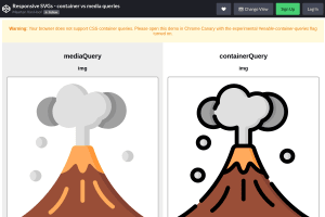
Maarten shows here (only in Chrome Canary for now) how container queries will allow us to have responsive SVG images inline in the HTML.
Responsive SVG images where already possible as I shown 8 years ago, but only external, loaded with an <img /> tag or as CSS background.
 Ahmad Shadeed
 Scott Jehl

 Zach Leatherman

 Johannes Odland