Responsive Icons with SVG
There have already been some explorations on responsive SVG images a while back, but when Joe Harrison posted a responsive icon concept on Dribbble and even a working version on a dedicated website, a few people thought this was so wrong they had to make their own version. I must admit I'm one of them… 😉
Mariusz Ciesla made a version with one single div, using one single sprite image:
See the Pen Responsive Icons by Nicolas Hoizey (@nhoizey) on CodePen.
Justin Avery, famous for the Responsive Design Weekly newsletter made his own version also with a single SVG image, but with Media Queries inside the SVG itself:
See the Pen Responsive Icons by Nicolas Hoizey (@nhoizey) on CodePen.
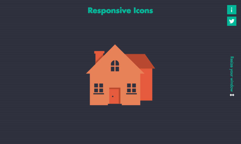
My own attempt tries to really use SVG features, by using sub elements as progressively revealed building blocks, instead of full houses for every breakpoint. The purpose is to remove as much redundancy as possible, and add some semantic on the way.
There have been concerns in the Dribble comments that the original have too much variation for a single icon, that will affect memorability and recognition. I tend to agree and did only improve details without modifying the whole design of the icon at the larger size.
SVG is even inline in the HTML, so there is no additional request at all.
See the Pen SVG Responsive Icons by Nicolas Hoizey (@nhoizey) on CodePen.
I made a little screencast for those who don't have SVG support in their browser:
There are still some parts missing:
- maybe more detailed icon for huge sizes;
- a fallback for browsers lacking SVG support.
March, 5th 2014 update: There is a more detailed post now on Smashing Magazine, written by Ilya Pukhalski: Rethinking Responsive SVG
 Scott Jehl

 Zach Leatherman
 Tyler Sticka