
 Josh W. Comeau
The CSSWG deserves a lot of credit, in my opinion, for repurposing/extending CSS keyframe animations for scroll-driven animations. Rather than invent…
There are 138 contents with this tag:
The CSSWG deserves a lot of credit, in my opinion, for repurposing/extending CSS keyframe animations for scroll-driven animations. Rather than invent…
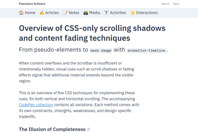
Overview of CSS-only scrolling shadows and content fading techniques
When content overflows and the scrollbar is insufficient or intentionally hidden, visual cues such as scroll shadows or fading effects signal that…
Try text scaling support in Chrome Canary
Just like how the tag tells the browser that your website is designed to work for small viewport sizes, the tells the browser, 'Hey, I've designed…

Alvin Leung, Taha Hossain, Shen Gao, Ben Giannis and Rafi Rizky
A new (or rather, old) approach to typography on the web
The strongest type systems are opinionated. They respond thoughtfully to the environment they inhabit, carrying a voice that cannot be captured by…
Solved By Modern CSS: Section Layout
In this article, I took a typical section design and made it more dynamic with container queries, has, clamp, and grid. It’s an example of the potential…
Zell Liew
Tailwind's @apply Feature is Better Than it Sounds
Tailwind’s utilities are very powerful by themselves, but they’re even more powerful if you allow yourself to use @apply (and allow yourself to…
CSS Custom Properties vs. Sass Variables: A Pragmatic Guide
The interplay between Sass variables and CSS custom properties should be a strategic partnership. Over nearly a decade of evolving web practices,…
The fact is folks who use Tailwind aren’t thinking about responsibility and scale in this way. They are thinking how can I push this out as fast as…
Item Flow, Part 1: A new unified concept for layout
As we worked through the details, we started to get excited. Suddenly new features for Flexbox and Grid that people have wanted for years had an obvious…

Never do pixel math with em and rem units. That’s where we went wrong, by assuming that 16px == 1em is a reliable fact. It reminds me a lot…
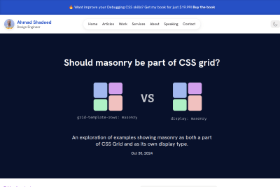
Should masonry be part of CSS grid?
An exploration of examples showing masonry as both a part of CSS Grid and as its own display type. Ahmad provides compeling use cases and code examples…
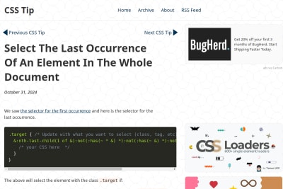
Select the last occurrence of an element in the whole document
Oh CSS… 😍

anyone should be able to make a website with HTML if they want. This book will teach you how to do just that. It doesn’t require any previous experience…
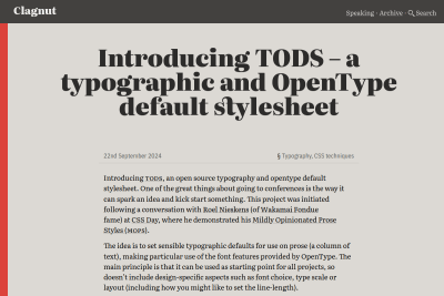
Introducing TODS – a typographic and OpenType default stylesheet
The idea is to set sensible typographic defaults for use on prose (a column of text), making particular use of the font features provided by OpenType.…
Is the sticky thing stuck? Is the snappy item snapped? A look at state queries in CSS
Is the sticky thing stuck? A lot of us have been there, we have a header navigation that should remain sticky and should only show a shadow from the…
The thing with switching to a new formatting context, as we do with flex and grid layouts, is that the minute you use display: flex or `display:…
Learn Grid Now, Container Queries Can Wait
There’s no rush to rip out all your media queries, and replace them with containers. You’ll be fine waiting for widely available support and your…
Have It All: External, Styleable, & Scalable SVG
here I'll demonstrate a 4th approach that I think hits the center of the venn diagram for External, Styleable, and Scalable SVG.
Fit-to-Width Text: A New Technique
Registered custom properties are now available in all modern browsers. Using some pre-existing techniques based on them and complex container query…

Cory Rylan
Flow Charts with CSS Anchor Positioning
With the introduction of the CSS Anchor Position API in Chrome 125, it's never been easier to position an element relative to another element. This…
How should I read the values for box-shadow-position in the formal syntax of box-shadow on MDN?
It says <box-shadow-position> = [ outset | inset ] which I read as: the value is either outset or inset. But I know outset is not supported. It is the default behavior, not the default value.
Maybe I need a documentation of these formal syntaxes… 😅
Hardest Problem in Computer Science: Centering Things
Even if it’s hard. Even if tools make it inconvenient. Even if you have to search for solutions. Together, I trust, we can find our way back to putting…
Most mentions of the magical CSS object-fit: cover; in development tutorials should be accompanied by a warning: in most situations, it means the browser will download an image that is larger than required (at least in one direction), and optimization on the server side could be a better option.
An Interactive Guide to CSS Container Queries
Ahmad Shadeed once again offers us a very detailed and interactive article - a true work of art! While building layouts in CSS, we always wanted a…

67 Weird Debugging Tricks Your Browser Doesn't Want You to Know
A list of useful, not-obvious hacks to get the most out of your browser’s1 debugger. Assumes an intermediate-level-or-higher understanding of the…
How we’re approaching theming with modern CSS
in the context of heavy theming, semantic CSS is going to be the key for long term success, not atomic stylesheets (ASS)
View transitions: Handling aspect ratio changes
When folks ask me for help with view transition animations that "don't quite look right", it's usually because the content changes aspect ratio. Here's…
My take on fading content using transparent gradients in CSS
So that's two ways to fade text content. mask-image is a little more flexible, but background-clip is a little more widely supported. Both are…
I wonder if MDN could add screenshots of the live examples, so people can see the result even if their browser doesn't support a feature yet.
For example for CSS Grid masonry layout:
https://developer.mozilla.org/en-US/docs/Web/CSS/CSS_grid_layout/Masonry_layout
I'm using Firefox, so I had to activate the layout.css.grid-template-masonry-value.enabled flag to see the “good” result.
An Interactive Guide to CSS Grid
In this tutorial, I'm going to share the biggest 💡 lightbulb moments I've had in my own journey with CSS Grid. You'll learn the fundamentals of this…
Worth mentioning again that this is just CSS with a touch of HTML. Also worth pointing out that very little of this is specific to CSS view transitions.…
View transitions and stacking context: Why does my CSS View Transition ignore z-index?
Paint order, the order in which your elements are painted, cannot be easily calculated without applying a complex algorithm, especially since many…
OKLCH in CSS: why we moved from RGB and HSL
By moving to OKLCH today, we’re preparing ourselves for the not-so-distant future where native color modification will be available in CSS. OKLCH…
Educational Sensational Inspirational Foundational
A historical record of foundational web development blog posts. I've already read most of these great articles, and will of course read the few missing.…
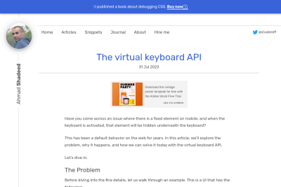
Have you come across an issue where there is a fixed element on mobile, and when the keyboard is activated, that element will be hidden underneath…
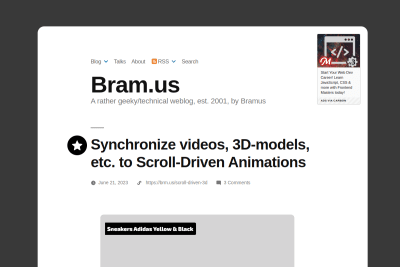
Synchronize videos, 3D-models, etc. to Scroll-Driven Animations
With Scroll-Driven Animations it’s really easy to animate elements as they enter/exit/whatever. But what if you want to sync a video to that? Or maybe…

Cropping Images with CSS While Keeping a Focal Point in the Center
This is a lovely way to deal with image crop and focal point with CSS only! 😍 And I love that Johannes put this warning in the beginning: While client-side…
This is the new CSS. The most powerful design tool for the Web ever. Only by using CSS, you can leverage what the platform is now capable of. Only…
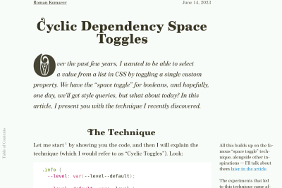
Cyclic Dependency Space Toggles
this method is so simple and powerful I'm not so sure about the "simple" part… 😅 But I definitely agree about the "powerful" one! 🤯

Watch Out for Layout Shifts with ‘ch’ Units
In our case, we were using ch units to define our page layout. This meant that our post content was equal to 50ch units (or the width of fifty…
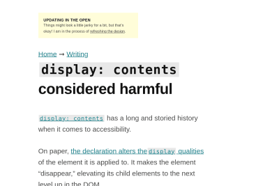
display: contents considered harmful
At this point, I don’t think we as an industry can use display: contents with confidence. Past actions are a good indicator of future behavior,…
Do you know good tutorials and/or examples about dealing with responsive images that are fluid horizontaly, but with a fixed height?
Using object-fit: cover; in the CSS is easy, but how can we prevent loading many pixels that will be hidden, without using too many <source> in a <picture>?
HTML and CSS based View Transitions are coming
While same-document View Transitions have now been available for a while in Chromium browsers for Single Page Applications (SPA), they were requiring the use of a JavaScript API. Chrome Canary now allows us to develop and test View Transitions with HTML and CSS only, obviously targeting Multiple Pages Applications (aka Web sites 🤷♂️).
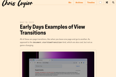
Early Days Examples of View Transitions
All of these are page transitions, like when you leave one page and go to another. As opposed to the document.startViewTransition kind, which are…
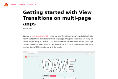
Getting started with View Transitions on multi-page apps
View Transitions for MPAs are a feature that’s high on my CSS wishlist, so I got to it. It took less than an hour to do, requires zero JavaScript,…
TIL: a:link in CSS doesn't match a elements without any href attribute! 😲
https://codepen.io/nhoizey/pen/dyggeOJ
It makes sense, but I never use a elements without href attributes (different from # of course), so I didn't know… 🤷♂️
The ongoing defence of frontend as a full-time job
We truly are the shape shifters of the market. So to say that someone who is “just” a frontend developer isn’t flexible enough means first and foremost…
Live, in-browser detection of modern CSS support for selectors, features, and at-rules. Applies support-based classes, exposes a results object, and…
I'm really honored to see my article about running CSS animations only if both the device and the user allow it being mentioned in the 99th episode of Stefan Judis' great Web Weekly newsletter! 🥰
Pixels vs. Relative Units in CSS: why it’s still a big deal
Remember, users really do change their settings under the hood, and we should be maintaining users’ control over their own browsing experience. If…
3 Methods for Scoped Styles in Web Components That Work Everywhere
WebC allows folks to broaden access to things built with web components without the drawbacks of other methods I really have to try WebC more seriously,…
Running CSS animations only if both the device and the user allow it
Thanks to Chrome release notes, I discovered today that there is an update media feature which accepts values fast, slow and print, to set styles depending on the ability of the device to update the rendering and the speed of it. As I'm already respecting the user's preference with the prefers-reduced-motion media feature, I wondered how I could progressively enhance this with the new media feature.
Chrome 113 beta adds support for @media (update: slow) (Firefox already has it), great to remove some animations.
But can we @supports a @media to use it only if supported? I don't think so.
How do you use new @media features progressively?
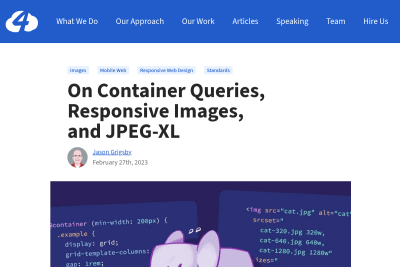
On Container Queries, Responsive Images, and JPEG-XL
It is natural to think that the problem with images in container queries is a mere oversight. We used to only have media queries to design with. Now…
Using :is() in complex selectors selects more than you might initially think
While I wouldn’t write a selector like that myself, this is highly relevant because of CSS Nesting that is getting specified. There, the Nesting Selector…
what will happen to Sass’s nesting? First of all, we won’t ever change existing valid Sass code so that it starts emitting CSS that’s incompatible…
Ten tips for better CSS transitions and animations
users may not realize what it is about the transitions or animations on our websites and apps, but they can keenly spot the difference between good…
Firefox 110 will be released on February 14th, for all Container Queries lovers! 🥰

The Right Way to Use fonts.com Web Fonts
Let’s talk about web fonts. More specifically, about a mistake I have seen developers make in several projects for different agencies: Embedding a…
While we wait for browsers to implement the text-wrap: balance; #CSS property and value for text (pleeeeeease! 🙏), I may have created a silly — and probably sub-optimal — function to do it with HTML block elements:
https://codepen.io/nhoizey/pen/mdjbrVx
Tell me what you think!
But why? Just because a colleague needed it, we could not find a solution in pure CSS, and I like challenges… 😅
Many of the latest additions to HTML, CSS, and JavaScript first existed as JavaScript libraries or frameworks or pre-processors or polyfills and then…
Our web design tools are holding us back
nowadays we can build things with CSS that are impossible to create with our design tools. We have scroll-snap, we have complicated animations, we…
Layout & Grid in Design Systems
This interdisciplinary disconnect around grid’s mental model affects how teams execute grid. In a broken, unidirectional, “developer handoff” process,…
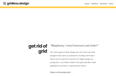
The web is good at these things, just not in the ways that designers have been accustomed to working. We'll take a look at how we got here and how…
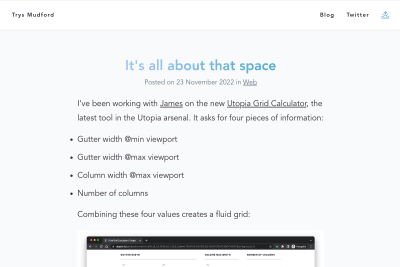
Yet another great Utopia tool, this time for grids, but the right way: the 12 column grid itself is an illusion, or at best a fading artefact of the…
Sam Magura
Why We're Breaking Up with CSS-in-JS
Thanks for reading this deep dive into runtime CSS-in-JS. Like any technology, it has its pros and cons. Ultimately, it's up to you as a developer…
TIL @media not (min-width: 60rem) { … } doesn't work in Safari, while it works in Chromium and Firefox.
Safari requires a media type, like all.
So here's the "right" syntax:
@media not all and (min-width: 60rem) { … }
Malte Ubl
a tool that automatically matches the fallback font to the custom font–because computers are good at that stuff. The tool allows you to select every…
Brian Louis Ramirez
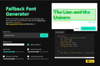
Reduce Cumulative Layout Shift (CLS) by adjusting web fonts and system font fallbacks using special @font-face descriptors.
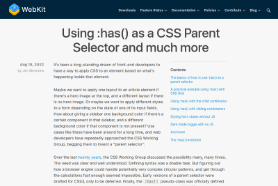
Using :has() as a CSS Parent Selector and much more
let’s take a step-by-step hands-on look at what web developers can do with this desperately desired tool. It turns out, the :has() pseudo-class…
Hubert Sablonnière
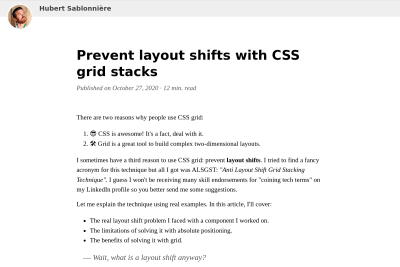
Prevent layout shifts with CSS grid stacks
I keep sending people this clever solution provided by Hubert, I wonder why I still didn't add it to my links! 😎 No more layout shifts! Compared…
💡 CSS idea of the day:
:root {
--full-height: 100vh;
}
@supports(height: 100dvh) {
:root {
--full-height: 100dvh;
}
}
Clever? Stupid? Old?
This is really clever, I hope we'll get support for :has() everywhere soon! I can remember a time when it was difficult to find selectors that would…
The Surprising Truth About Pixels and Accessibility: should I use pixels or rems?
Josh's attention to details in all his articles is awesome. Here, he's presenting evidences that the rem unit should be used for font sizes, media…
The Minimum Content Size In CSS Grid
Sometimes, while building a component, you suddenly notice a weird horizontal scroll bar. You keep trying and fixing the wrong thing, only to realize…
I started updating my photography site with new Media Queries and CSS environment variables to make sure Surface Duo owners enjoy it even more! 🎉
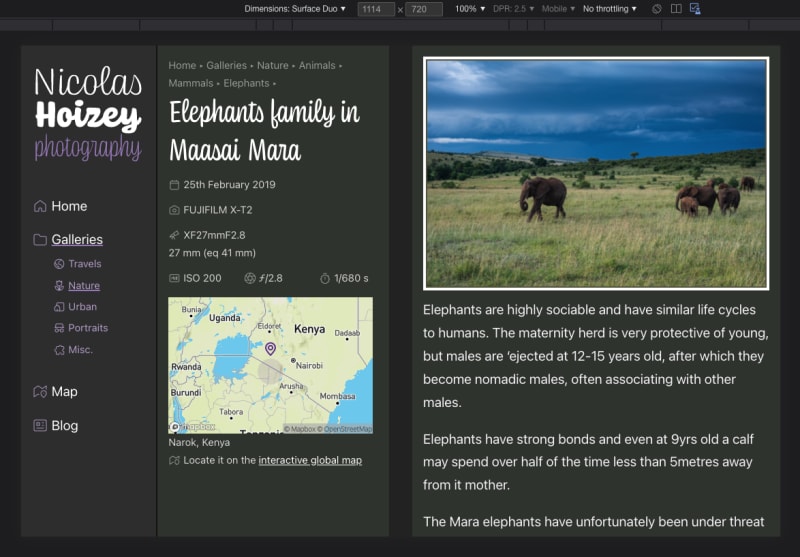
Other foldable devices will come if it makes sense.
You have a Surface Duo? Feedback is welcome! 🙏
Kev Bonett
Expandable Sections Within a CSS Grid
This is a great use case for CSS Grid's dense packing algorithm! I also love how Kev suggests this could replace annoying pop-ins/modals: This could…
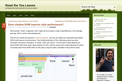
Does shadow DOM improve style performance?
This article is about style performance improvement with Shadow DOM, but it also contains a useful comparison of selector performance between ids,…
Anyone knows why in #Firefox sometimes the button in the bottom of https://nicolas-hoizey.com/archives/ is outside its container, while everything is fine in #Chrome? 🤔
Maybe a CSS Grid issue?
Rendering issue in Firefox
Everything is fine in Chrome
I didn't know comments could be featured on @css, but it looks like it's a thing! 😲
Thanks @markconroy, sorry for the late discovery. 🙏
Based on #CanIUse data, using gap with Flexbox with no fallback means half iOS users won't get the right layout.

It might be a bit too soon… 🥲
Working on my photography site, I wanted to show a few photos from folder in a gallery, and built something cool with just CSS.
But is it really cool, or just cool once and then annoying?
Try it live on desktop: nicolas-hoizey.photo/travels/europe/
youtu.be/VmwJ4KInloQ
I finally decided the effect on hover was too invasive and difficult to tweak, so I changed for a much more traditional way to show multiple images of a folder: a diaporama with a Ken Burns effect.
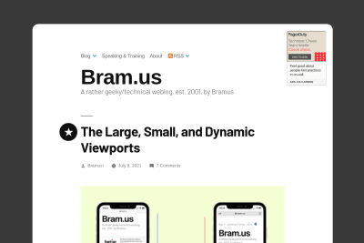
The Large, Small, and Dynamic Viewports
Bramus shows how the situation might finally improve for viewport height CSS units, more than 6 years after I reported the unreliable 100vh value…
Is the margin-block CSS logical property really still not supported in #Edge ? 😭
https://developer.mozilla.org/en-US/docs/Web/CSS/margin-block#browser_compatibility
Ryan Mulligan
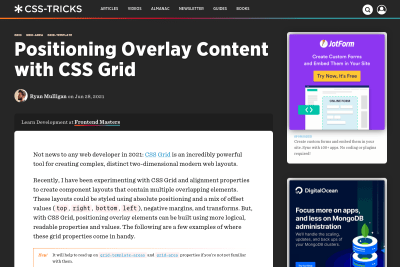
Positioning Overlay Content with CSS Grid
These are really nice ways to use CSS Grid!
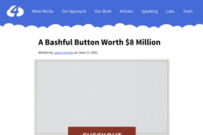
A Bashful Button Worth 8 Million Dollars
6 years ago I reported a bug about 100vh being larger than the viewport height in Safari. It was "intentional" according to webkit/Safari team, and…
Maarten Van Hoof
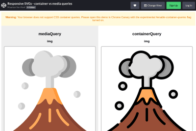
Responsive SVGs - container vs media queries
Maarten shows here (only in Chrome Canary for now) how container queries will allow us to have responsive SVG images inline in the HTML. Responsive…
Building a new site with the beautiful Coniferous web font from @OHnoTypeCo and I can't find the right "web safe" fallback font to be able to optimize Cumulative Layout Shifts. 😭
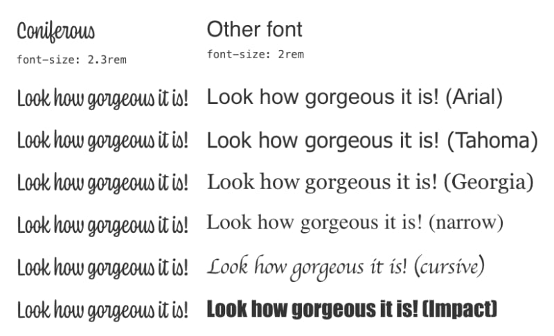
Any suggestion?
Worked on a site with an SVG sprite used as CSS background, and was painfully reminded of why I didn't do that in other projects yet.
A 7 years old bug in #Firefox … 😭
https://bugzilla.mozilla.org/show_bug.cgi?id=1027106
I know there are workarounds.
Sarah Dayan
No, Utility Classes Aren't the Same As Inline Styles
People who follow me should now know that I'm not a big fan of "utility alone" CSS (yet?), but I do use some utility classes in my own code and understand…
4329 is a long discussion about how people are really, really, REALLY unhappy how on mobile the viewport units don't represent the size of the viewport — @fantasai https://github.com/w3c/csswg-drafts/issues/4329#issuecomment-814281379
😅
6 years later, this is still my most read article…
When I import my Google Analytics data in #CanIUse, it says only 80 % of my visitors have support for CSS clamp(), while it's 90 % globally. 🤔
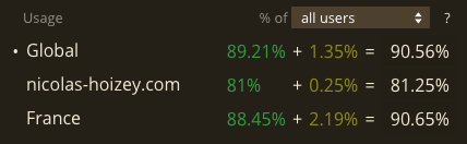
I have almost only tech-savvy visitors, so I don't understand. 🤷♂️
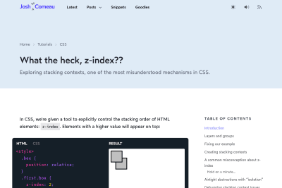
I learned a lot with this detailed article about z-index! When it comes to CSS, things work in a similar way: elements are grouped into stacking…
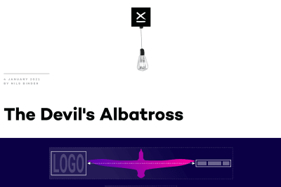
Nils Binder
A new nice responsive layout trick built upon Heydon Pickering's Flexbox Holy Albatross.
Is there some sort of shape-outside: self; in CSS, to use an image as it's own shape? 🤔
I couldn't find it in any docs, but it would be really useful to not declare the same URL twice.

Xiao Zhuo Jia
So there it is, 5 different variations of fully accessible, CSS only mobile menu. I might have overdone it, but it was fun.
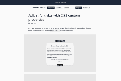
Romaric Pascal
Adjust font size with CSS custom properties
I do love beautiful Web fonts, even if there are none on this site currently, so I plan to add at least one soon. I might use this nice solution.…
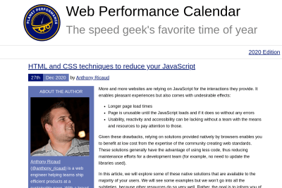
Anthony Ricaud
HTML and CSS techniques to reduce your JavaScript
relying on solutions provided natively by browsers enables you to benefit at low cost from the expertise of the community creating web standards.…
I'm a developer, not a graphic designer, so I genuinely wonder if CSS Grid and Flexbox automated layout and space management would be better for the flexible Web than such rigid artificial grids. I'm really wondering.
Responsive Grid Design: Ultimate Guide
This article highlights the most important aspect of the responsive grid and how product designers can adapt grids in their design workflow. medium.muz.li/responsive-grid-design-ultimate-guide-7aa41ca7892
Get a list of local URL links from a root URL. Works with JavaScript generated content. Can also act as a live-DOM CSS search across multiple files…
Wonder if #EveryLayout's sidebar could be used for a media component where the image is on top by default, and on the right when there's enough space.
Looks like it's either 1st element on the left or 2nd element on the right… 🤔

-loud-minority%2F)
Always remember that although a subset of the JavaScript community can be very loud, they represent a paltry portion of the web as a whole. This means…
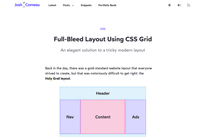
Full-Bleed Layout Using CSS Grid
Josh shows here beautifully how to use CSS Grid to contain page elements' width and have some expand outside this containment. As the web has evolved,…
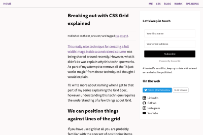
Breaking out with CSS Grid explained
Here is a detailed explanation of Tyler Stika's Breaking Out With CSS Grid Layout article I shared previously. What this demonstrates is that when…
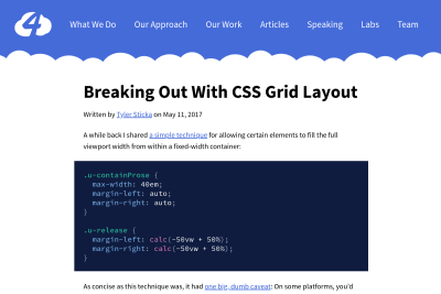
Breaking Out With CSS Grid Layout
Now that CSS Grid support in browsers is great, I will start using this nice layout presented by Tyler more than 3 years ago. We want to limit the…
Evan Minto
Intrinsically Responsive CSS Grid with minmax() and min()
I've been using a CSS Grid layout on some pages here for a while, and had issues with some of it triggering an horizontal scroll on thin viewports…
Stéphanie Walter
Enhancing User Experience With CSS Animations
Another amazing resource from Stéphanie, a detailed transcript of a talk she gave for Shift Remote. With CSS and JS progress, implementing animations…
Style Stage and old people of the web
Let’s not get too hung up about the past and how much great and good we did back then. And let’s fight that first urge to be snarky and feel a “oh…
Sara Soueidan
Inclusively Hiding & Styling Checkboxes and Radio Buttons
Sara shows us how to properly use SVG and CSS to design beautiful, engaging and accessible checkboxes and radio button in her new very detailed article,…
Sebastiano Guerriero
I remember seing a clever design years ago that had this effect on scroll, but it was just for a logo, with a single image. Now that we have clip-path…
I know some utility classes can be useful, and #Tailwind helps some devs create pages without (really) knowing #CSS, but is it enough to justify this logorrhea in our HTML?
Keir Watson
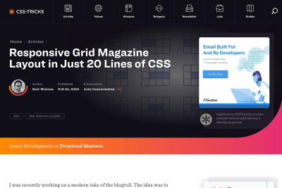
Responsive Grid Magazine Layout in Just 20 Lines of CSS
Interesting dive into some of CSS Grid subtleties, to build a nice magazine layout. Incredibly, this layout only took 21 lines of CSS (excluding global…
Vincent De Oliveira
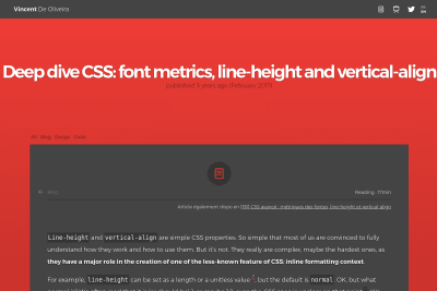
Deep dive CSS: font metrics, line-height and vertical-align
Line-height and vertical-align are simple CSS properties. So simple that most of us are convinced to fully understand how they work and how to use…
Amelia Wattenberger
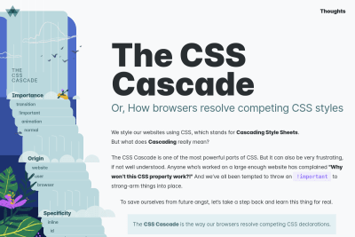
The CSS Cascade, or how browsers resolve competing CSS styles
This is a great explanation/illustration of the CSS Cascade! 👍
If you don't understand why CSS is one of the great strengths of the Web, even if you've been using it for a while, you really have to spend these…
Rémy Parmentier
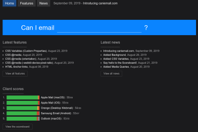
Rémy and a few others launched an awesome resource for people who plan to struggle with rich email using HTML and CSS, which are not well supported…
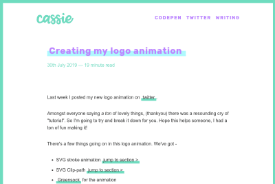
Cassie Evans
Cassie Evans shares the multiple steps involved in the creation of the lovely animated logo of her personal website: There's a few things going on…
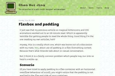
Chen Hui Jing
Chen Hui Jing helps fix a little issue with overflowing Flexbox containers: If you have tried to apply padding to a flex container with an horizontal…
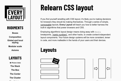
Every Layout: Relearn CSS layout
Andy and Heydon teach us CSS layout with modern standards, what they call "algorithmic layout design ": Employing algorithmic layout design means…
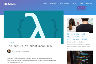
Jay Freestone
Functional CSS (sometimes referred to as atomic CSS) is the practice of using small, immutable and explicitly named utility classes to construct components.…
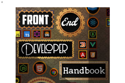
Cody Lindley
Front-end Developer Handbook 2019
If you want to grok the great diversity of topics and technologies involved in Front-end Web development, here is probably the most comprehensive…
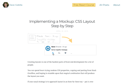
Dave Ceddia
Implementing a Mockup: CSS Layout Step by Step
If you don't know yet how to do Web layout with CSS, or feel like struggling with it, this great (baby) step by step tutorial will help you a lot:…
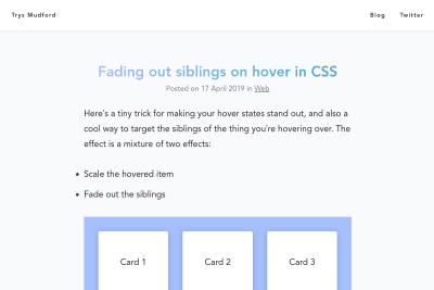
Fading out siblings on hover in CSS
Trys here shows a nice little CSS trick to make hovered elements pop out (quite easy), while diming the siblings (that's the trick). Well done!
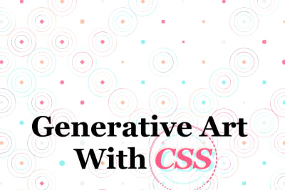
Yuan Chuan
Yuan Chuan creates art from everything available in CSS, created < css-doodle /> (a web component for drawing patterns with CSS), and gave a talk…
Rob Weychert
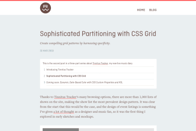
Sophisticated Partitioning with CSS Grid
Tinnitus Tracker is the live music diary of Rob Weychert, listing more than 300 shows he's attended. Events lists can be really boring to scroll through,…
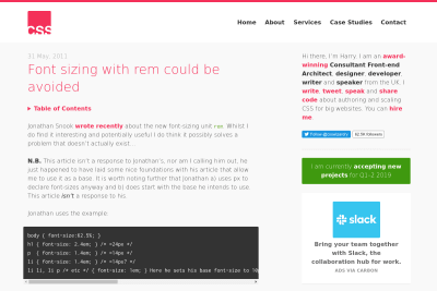
Font sizing with rem could be avoided
I don't really agree with the simple statement made in the title of this article, as sizing fonts with rem is sometimes useful to escape the default…
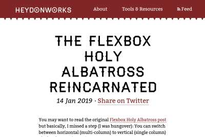
The Flexbox Holy Albatross Reincarnated
when you have three items, you’ll be happy with the three-abreast layout and accepting of the single-column configuration. But you might like to avoid…
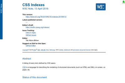
CSS Indexes: A listing of every term defined by CSS specs
This is a non-normative document. It lists every term defined in CSS, as long as it’s marked up correctly for the spec generator. It is intended as…
Viewport height is taller than the visible part of the document in some mobile browsers
When trying to use a 100vh CSS value to build a new interface for a game that would use the full viewport, I discovered that this full height value…
There have already been some explorations on responsive SVG images a while back, but when Joe Harrison posted a responsive icon concept on Dribbble and even a working version on a dedicated website, a few people thought this was so wrong they had to make their own version. I must admit I'm one of them… 😉
OK, on le sait tous, « there is no page fold », mais savoir où est ce non fold peut être carrément utile, alors heureusement qu'il y a des outils…
Les spammeurs s'y connaissent en CSS
Un p'tit malin qui se fait appeler Sylvain a laissé un commentaire très sympathique sur mon billet précédent. Mais il a aussi glissé subrepticement…
Laissons IE6 mourir sans style, et ses utilisateurs entrevoir la lumière
Bon, allez, ça va un peu les enfantillages, mais il est temps de montrer aux utilisateurs de IE6 que non, ils n'utilisent pas un bon navigateur, mais…
Oncle Tom m'a envoyé en douce il y a quelques jours une patate chaude en m'invitant à vous parler de mes conventions de codage. Vaste sujet, et surtout…
Afficher les favicon dans la barre personnelle de Firefox sous Mac OS
Dans sa version Mac OS, Mozilla Firefox est configuré pour ne pas afficher l'icône personnalisée d'un site à côté d'un favori placé dans la barre…
CSS : on reprend tout à zéro !
Pompage vient de publier les dernières traductions des excellents tutoriaux « CSS from the Ground Up » de Joe Gillespie, ce qui clôt la série. Un…
Un effet graphique assez répandu, au point d'envahir notamment les interfaces graphiques des différents OS, est celui des ombrages. Les ombres permettent…
Gastero Prod 4, les standards et l'accessibilité
L'accessibilité devient petit à petit incontournable. Outre ses avantages directs en terme d'élargissement d'audience des sites, elle a tendance dans…
See all tags.
 Francesco Schwarz
 Josh Tumath
 Ahmad Shadeed
 Stuart Robson
 Donnie D'Amato
 Miriam Suzanne
 Temani Afif
 Blake Watson
 Richard Rutter
 Brecht De Ruyte
 Rachel Andrew
 Scott Jehl
 Roman Komarov
 Nikita Prokopov
 Alan Norbauer
 Jake Archibald
 Kilian Valkhof
 Tyler Gaw
 Nic Chan
 Zach Leatherman
 Bramus Van Damme
 Johannes Odland
 Matthias Ott
 Paul Hebert
 Eric Bailey
 Chris Coyier
 Dave Rupert
 Christian Heilmann
 Stephanie Eckles
 Kathleen McMahon
 Jason Grigsby
 Natalie Weizenbaum
 Josh Collinsworth
 Vasilis van Gemert
 Brad Frost
 Trys Mudford
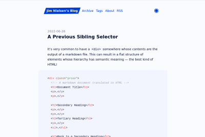
 Jim Nielsen
 Nolan Lawson


 Tyler Sticka
 Harry Roberts