Note from 15 December 2021

I started updating my photography site with new Media Queries and CSS environment variables to make sure Surface Duo owners enjoy it even more! 🎉

My photography site in a simulated Microsoft Surface Duo

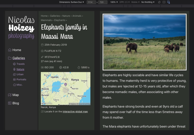
Other foldable devices will come if it makes sense.

You have a Surface Duo? Feedback is welcome! 🙏


  1. Do you know good tutorials and/or examples about dealing with responsive images that are fluid horizontaly, but with a fixed height?

    Using object-fit: cover; in the CSS is easy, but how can we prevent loading many pixels that will be hidden, without using too many <source> in a <picture>?

  2. TIL @​media not (min-width: 60rem) { … } doesn't work in Safari, while it works in Chromium and Firefox.

    Safari requires a media type, like all.

    So here's the "right" syntax:
    @​media not all and (min-width: 60rem) { … }