Stéphanie Walter
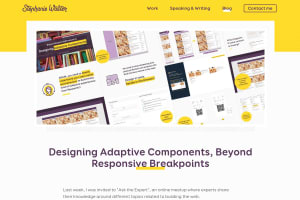
Designing Adaptive Components, Beyond Responsive Breakpoints
https:/
A great talk from Stéphanie about responsible use of responsive components:
In the talk, I show how I design systems of components that go beyond responsive adaptation to different screen/viewport size and can also be used in different layout and container contexts. I also try to make sure that my components work beyond the perfect “happy path perfect situation”: what happens with super long text, missing images/content for example? And how about adapting components to user needs across specific points in their journey and build truly adaptive systems?
Stéphanie shares the slides, a video recording AND the transcript. 👍
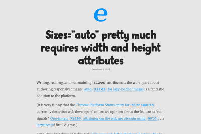
 Eric Portis
 Scott Jehl
 Zach Leatherman
 Andy Bell
 Leanne Renard