Try text scaling support in Chrome Canary
Just like how the tag tells the browser that your website is designed to work for small viewport sizes, the tells the browser, 'Hey, I've designed…
There are 64 contents with this tag:
Try text scaling support in Chrome Canary
Just like how the tag tells the browser that your website is designed to work for small viewport sizes, the tells the browser, 'Hey, I've designed…
Baseline can definitely be perfected. Now that we have an initial definition, and now that adoption has grown, we can improve Baseline based on real…

I despise accessibility overlays, and get really quite upset when they're mentioned in a serious context. Unfortunately, getting increasingly upset…
Gwendolyn Rak
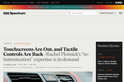
Tactile Controls: Why Buttons Are Making a Comeback
When I’m driving, it’s actually unsafe for my car to be operated in that way [with a touchscreen]. It’s hard to generalize and say, buttons are always…
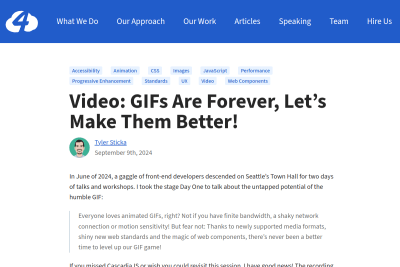
GIFs Are Forever, Let’s Make Them Better
Everyone loves animated GIFs, right? Not if you have finite bandwidth, a shaky network connection or motion sensitivity! But fear not: Thanks to newly…
Web Accessibility Initiative (WAI)
The Business Case for Digital Accessibility
Public use of the web is more than 25 years old. It is no longer a novelty but an integrated, critical tool of modern life. As smart businesses integrate…
Arguments for opening links in a new tab or window
A significant percentage of web professionals believe that opening outbound links in new tabs or windows provides a benefit to site owners. Why? Is…
Dear photographers using Adobe Lightroom, is there a way to search for photos based on the content of EXIF/IPTC fields that are not available in the metadata filters of the Library Filter bar?
I want to build a dynamic collection of images that don't have informations in the recently supported alternative text field, for accessibility.
Opportunities for AI in Accessibility
I have no doubt that AI can and will harm people… today, tomorrow, and well into the future. But I also believe that we can acknowledge that and,…
Doug Abrams
WCAG refers to testing viewports at 320 px wide and 256 px high. They chose these dimensions in part because they’re equivalent to a midrange desktop…
Comparing Manual and Free Automated WCAG Reviews
My concern is that too many managers, bosses, stakeholders, and even testers, may do no more than run a free automated [accessibility testing] tool…
Cooper Hewitt Accessibility
Cooper Hewitt Guidelines for Image Description
Image descriptions help visitors who are blind or have low-vision access the information contained in images. Description also makes it easier to…
display: contents considered harmful
At this point, I don’t think we as an industry can use display: contents with confidence. Past actions are a good indicator of future behavior,…
The intersectionality of web performance
Sure, those people almost certainly do care about the business. Who doesn’t? But they’re also humans. I feel like if really want to convince them,…
Pixels vs. Relative Units in CSS: why it’s still a big deal
Remember, users really do change their settings under the hood, and we should be maintaining users’ control over their own browsing experience. If…
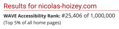
Is it ok to be proud to almost be in the top 25,000 of The WebAIM Million, the 2023 report on the accessibility of the top 1,000,000 home pages? ☺️
With "Number of accessibility errors detected: 0", my personal site is ranked #25,406 of the top 1,000,000 home pages.
Accessibility Beyond Code Compliance
Design systems (and pattern libraries within them) codify your organization’s design and coding guidelines in such a way that the software you produce…
Understanding the cost of not being accessible
the single worst accessibility-related business strategy you can take is to stay in that audit-fix-audit-fix cycle
Henny Swan
Browsing with assistive technology videos
Understanding how people with disabilities browse the web using assistive technologies (AT) is core to making an accessible and inclusive user experience.…
While both the alt attribute and the figcaption element provide a way to describe images, the way we write for them is different. alt descriptions…
Why you should never use px to set font-size in CSS
Let’s be very clear: it absolutely does matter what unit you use in your CSS. And you should avoid px when setting font-size wherever possible.…
Léonie Watson
How A Screen Reader User Surfs The Web
In this webinar you’ll learn how and why semantic HTML helps screen reader users browse your website, whilst being mostly transparent to people who…
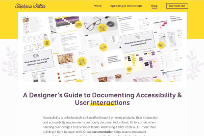
Stéphanie Walter
A Designer’s Guide to Documenting Accessibility & User Interactions
A lot of sites were not designed and developed with accessibility needs in mind. As designers, a lot of us think that “accessibility is the job of…

Nate Baldwin
Nate Baldwin created an amazing resource about colors, with interactive examples that help understand many concepts. This website is for designers…
Ad Hoc
The Ad Hoc Accessibility Beyond Compliance Playbook
We see accessibility as a duty in our mission to better serve people. We believe in the social model of disability […], which means we hold responsibility…
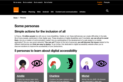
Orange Digital Accessibility
Some personas - Orange digital accessibility guidelines
situations of digital disabilities aren’t inevitable, we can all act to avoid them. Are you a creator of communication media? Are you participating…
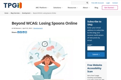
Lē McNamara
Beyond WCAG: Losing Spoons Online
Lē McNamara uses the spoon theory to explain how cognitively diverse people might suffer from some design decisions, even if sites respect current…
I really wish I could set my own colors for graphs in #SpeedCurve, or at least they should choose different ones, this is difficult to read when colors are so close to each other. 😔

The Surprising Truth About Pixels and Accessibility: should I use pixels or rems?
Josh's attention to details in all his articles is awesome. Here, he's presenting evidences that the rem unit should be used for font sizes, media…
Christine Vallaure
Why designers should move from px to rem - and how to do that in Figma
If you're a Web developer (as most of my readers), you already know that users DO change font size (in their browser preferences), so you make sure…
Add punctuation to your alt text
To add a description to an image, author a string inside of an alt attribute declared on an img element. Assistive technology will recognize the…
Accessible anchor links with Markdown-it and Eleventy
I like to be able to link directly to a section in a long content. I wish every site provided anchor links associated to headings, even if Text Fragments might be a cross browser thing sometimes in the future. Here's how I made the anchor links of my Eleventy based site accessible.
I feel sorry for anyone trying to get into the field of web performance. Not only are there complex browser behaviours to understand, there’s also…
The unreasonable effectiveness of simple HTML
Are you developing public services? Or a system that people might access when they’re in desperate need of help? Plain HTML works. A small bit of…
I just added buttons to quickly access previous and next content on large viewports.
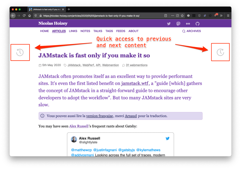
Now I wonder how to make them accessible, and how to show them on narrow viewports.
Improving Your Tweet Accessibility
Consider your audience. Consider making your tweets accessible. Now you can have a bigger audience.
Accessible SVG Icons with Inline Sprites
Standing on their own, icons can be misinterpreted […]. The most important issue though: they lack text. Text is the most accessible format for information…
Léonie Watson
Text descriptions and emotion rich images
A good alt text can conjure up wonderfully stimulating mental images. A friendly smile is the same in print, photo or wax crayon. Whether you listen…
Marie Manandise
Accessibility of Content Management Systems – what’s stopping us?
The funny thing was, no matter who we talked to or who we read from, the unanimous message was: “We care very much about accessibility”. And yet,…
Marcy Sutton
What we learned from user testing of accessible client-side routing techniques with Fable Tech Labs
There are multiple variations recommended in the industry for accessible, client-rendered page changes, yet very little user research on those methods.…
Sara Soueidan
Inclusively Hiding & Styling Checkboxes and Radio Buttons
Sara shows us how to properly use SVG and CSS to design beautiful, engaging and accessible checkboxes and radio button in her new very detailed article,…
Regardless of what accessibility conformance level you target, do not arbitrarily open links in a new window or tab. If you are required to do so…

We have to stop confusing the excesses of capitalism with the hallmarks of quality. Sometimes Google aren’t better, they’re just more pervasive.
Florens Verschelde
A short history of body copy sizes on the Web
A nice overview of the many variations body copy has seen since the Web exists. I agree with the conclusion: I’m […] sad that we’re somehow chasing…
Paint the Picture, Not the Frame: How Browsers Provide Everything Users Need
Eric describes the issues people can face while using browsers to navigate on the Web, with a lot of great accessibility hints. people who feel they…
Opquast
The Web Quality Checklist is intended for all professionals who create websites. It is designed in a collaborative way by a community of Web professionals,…
Font sizing with rem could be avoided
I don't really agree with the simple statement made in the title of this article, as sizing fonts with rem is sometimes useful to escape the default…
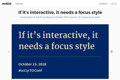
If it's interactive, it needs a focus style
I love this really didactic talk about focus styles: Focus styles don't have to be ugly! Focus styles are an integral part of any mature design system.…
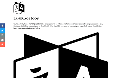
the language icon is an initiative started in 2008 to standardise the language selection icon, the idea and initial icon was designed by Onur Mustak…
Evan Minto wrote a great article showing the Internet Archive has tested the actual root font-size set by their visitors, and the result shows a lot of people still change the default one: Pixels vs. Ems: Users DO Change Font Size.
Soignez votre lisibilité avec des textes de largeur maîtrisée
Afin d'assurer une présentation optimale du texte pour la lisibilité, il est nécessaire de définir un nombre optimal de caractères par ligne quelle que soit la taille du texte.
People don't change the default 16px font size in their browser (You wish!)
I am really happy to still read articles that advocate for the use of proportional CSS units as em and rem in 2016. But there are often trolls that come comment these articles to say that we, who are using proportional units, are dumb, because there is no need for this. Here is an example. There are unfortunately two misleading urban legends in most web developers minds. I often call myself a troll, that's not that harsh when I'm the one saying it… 😉
J’ai soutenu le projet « A Blind Legend » sur Ulule dès que je l’ai découvert ! C’est un projet de jeu d’aventure pour mobile qui a la particularité…
Après avoir eu des retours plutôt nombreux et positifs suite à ma conférence à Paris Web 2013, j'ai retroussé mes manches pour proposer une version…
Ma conférence à Paris Web 2013
Après y avoir assisté plusieurs années en tant qu'auditeur, j'ai eu la joie — le privilège — d'être sélectionné parmi les orateurs de l'édition 2013.…
Un petit pas pour l'em, un grand pas pour le Web
Voici le pitch de la conférence que j'ai proposé d'animer à Paris Web 2013. Aujourd’hui, je parcours le Web principalement sur mon ordinateur portable,…
Le design de Gastero Prod est-il à jeter à la poubelle ?
Alarmé par certains commentaires faits sur Twitter par des personnes dont l'avis m'intéresse particulièrement, je me rends compte que ce que je considère…
Un petit débat sur la compatibilité cross-browser dans l'état de l'art du développement de sites Web
Adrien « Voulf » Leygues lance un petit débat sur l'état de l'art du développement de sites Web focalisé sur la compatibilité cross-browser. Voici…
Comment faire un tag cloud (nuage de tags, ou d'étiquettes) accessible ?
Vous avez déjà sans doute vu sur un site un «nuage d'étiquettes» — tag cloud en anglais — représentant la liste des sujets abordés, en mettant en…
La fin du HTML pour les applications accessibles via le Web n'est pas pour tout de suite
Laurent Jouanneau part de sa réaction face à l'avènement de SVG et Canvas, annoncés par Tristan Nitot, pour dénoncer l'usage abusif qui est fait de…
L'accessibilité, c'est aussi pour les handicapés
Quand on parle d'accessibilité, on a tendance à parler essentiellement des handicapés. Heureusement, Eric Daspect nous avait remis sur la bonne voie…
L'accessibilité, effet de mode ou réelle compréhension ?
L'interview de Lhorens Marie, Directeur Web et Technologies de Cosmosbay-Vectis par le Journal du Net est intéressante, puisqu'elle montre que l'accessibilité…
Gastero Prod 4, les standards et l'accessibilité
L'accessibilité devient petit à petit incontournable. Outre ses avantages directs en terme d'élargissement d'audience des sites, elle a tendance dans…
See all tags.