Jon Sneyers
How JPEG XL Compares to Other Image Codecs

https:/
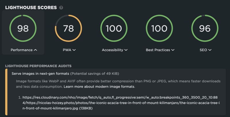
With many competing image formats available, it's not always easy to know which one(s) we have to use to provide both the best performance and visual quality to Web users.
With Responsive Web Design, it's even more difficult[1], with the need to provide multiple renditions of these images, at different dimensions, and sometimes even different ratios.
Jon Sneyers — creator of the FLIF format, one of JPEG XL inspirations — shows here how JPEG XL could help reduce complexity with native support for much better compression, great visual quality AND native responsiveness.
Let's hope browsers implement it fast when it reaching a stable status!
