 Donnie D'Amato
The web is good at these things, just not in the ways that designers have been accustomed to working. We'll take a look at how we got here and how…
There are 8 contents with this tag:
The web is good at these things, just not in the ways that designers have been accustomed to working. We'll take a look at how we got here and how…
Based on #CanIUse data, using gap with Flexbox with no fallback means half iOS users won't get the right layout.

It might be a bit too soon… 🥲
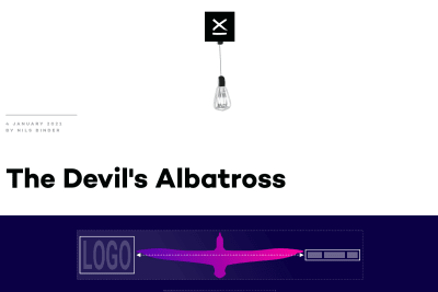
Nils Binder
A new nice responsive layout trick built upon Heydon Pickering's Flexbox Holy Albatross.
Wonder if #EveryLayout's sidebar could be used for a media component where the image is on top by default, and on the right when there's enough space.
Looks like it's either 1st element on the left or 2nd element on the right… 🤔

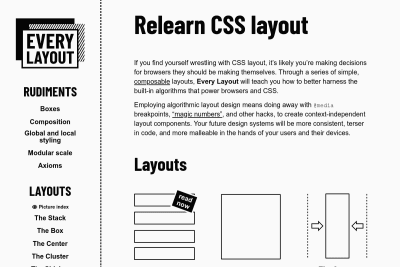
Every Layout: Relearn CSS layout
Andy and Heydon teach us CSS layout with modern standards, what they call "algorithmic layout design ": Employing algorithmic layout design means…
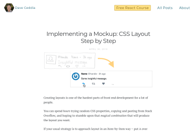
Dave Ceddia
Implementing a Mockup: CSS Layout Step by Step
If you don't know yet how to do Web layout with CSS, or feel like struggling with it, this great (baby) step by step tutorial will help you a lot:…
Rob Weychert
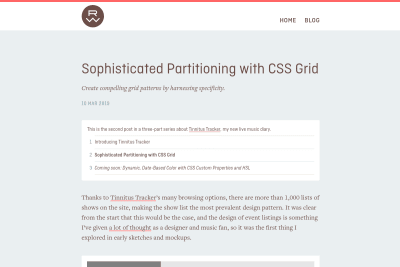
Sophisticated Partitioning with CSS Grid
Tinnitus Tracker is the live music diary of Rob Weychert, listing more than 300 shows he's attended. Events lists can be really boring to scroll through,…
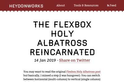
The Flexbox Holy Albatross Reincarnated
when you have three items, you’ll be happy with the three-abreast layout and accepting of the single-column configuration. But you might like to avoid…
See all tags.