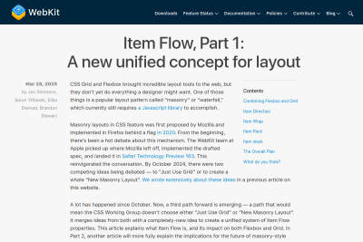
Item Flow, Part 1: A new unified concept for layout
As we worked through the details, we started to get excited. Suddenly new features for Flexbox and Grid that people have wanted for years had an obvious…
There are 9 contents with this tag:
Item Flow, Part 1: A new unified concept for layout
As we worked through the details, we started to get excited. Suddenly new features for Flexbox and Grid that people have wanted for years had an obvious…
While we wait for browsers to implement the text-wrap: balance; #CSS property and value for text (pleeeeeease! 🙏), I may have created a silly — and probably sub-optimal — function to do it with HTML block elements:
https://codepen.io/nhoizey/pen/mdjbrVx
Tell me what you think!
But why? Just because a colleague needed it, we could not find a solution in pure CSS, and I like challenges… 😅
The web is good at these things, just not in the ways that designers have been accustomed to working. We'll take a look at how we got here and how…
Based on #CanIUse data, using gap with Flexbox with no fallback means half iOS users won't get the right layout.

It might be a bit too soon… 🥲
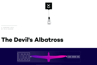
Nils Binder
A new nice responsive layout trick built upon Heydon Pickering's Flexbox Holy Albatross.
I'm a developer, not a graphic designer, so I genuinely wonder if CSS Grid and Flexbox automated layout and space management would be better for the flexible Web than such rigid artificial grids. I'm really wondering.
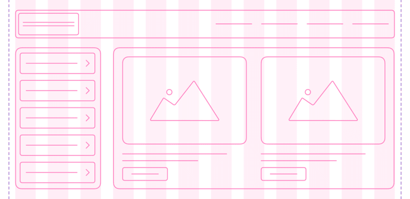
Responsive Grid Design: Ultimate Guide
This article highlights the most important aspect of the responsive grid and how product designers can adapt grids in their design workflow. medium.muz.li/responsive-grid-design-ultimate-guide-7aa41ca7892
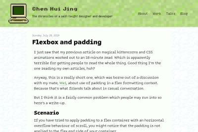
Chen Hui Jing
Chen Hui Jing helps fix a little issue with overflowing Flexbox containers: If you have tried to apply padding to a flex container with an horizontal…
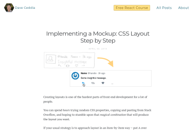
Dave Ceddia
Implementing a Mockup: CSS Layout Step by Step
If you don't know yet how to do Web layout with CSS, or feel like struggling with it, this great (baby) step by step tutorial will help you a lot:…
The Flexbox Holy Albatross Reincarnated
when you have three items, you’ll be happy with the three-abreast layout and accepting of the single-column configuration. But you might like to avoid…
See all tags.
 Donnie D'Amato

 Heydon Pickering