Note from 9 December 2021
Looks like @archdigestindia could improve #WebPerf for their readers and reduce bandwidth invoices…
- the photo is
564.5pxwide - but the
sizessays the image is full width - so the browser downloads an image
414 %bigger

Looks like @archdigestindia could improve #WebPerf for their readers and reduce bandwidth invoices…
564.5px widesizes says the image is full width414 % bigger
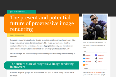
The present and potential future of progressive image rendering
So if the browser manages to download 6 kB then stalls, then AVIF can produce a better result. But since the AVIF rendering is only two-pass, if the…

kliksphilip
JPEG VS AVIF - The Battle of Compression
In this super thorough study I test one single HD image and come to vast sweeping conclusions about JPEG XL and AVIF. But that's still one image comparison…
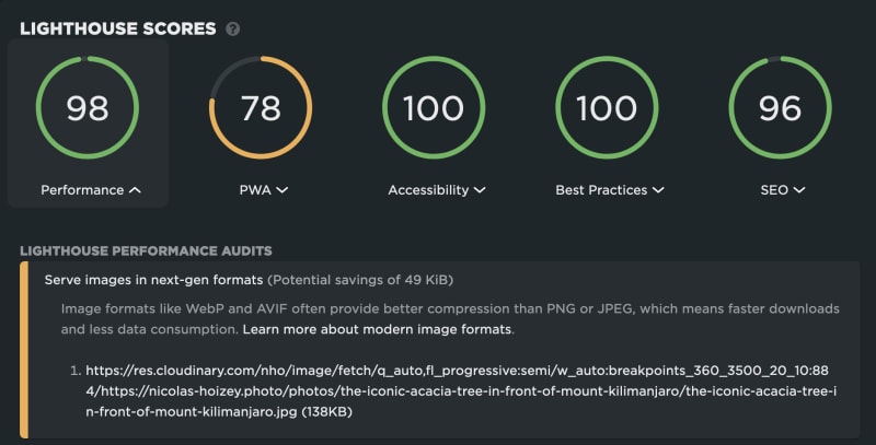
Should I please Lighthouse with modern image formats, or my visitors with progressive rendering of large images in my photography site? 🤔
Of course, this would be much easier with genaralized JPEG XL support, both modern and allowing progressive… 🤷♂️
Most mentions of the magical CSS object-fit: cover; in development tutorials should be accompanied by a warning: in most situations, it means the browser will download an image that is larger than required (at least in one direction), and optimization on the server side could be a better option.
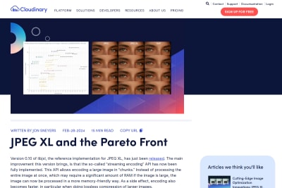
Jon Sneyers
This consolidates JPEG XL’s position as the best image codec currently available, for both lossless and lossy compression, across the quality range…
 Jake Archibald