It's all about that space
https:/
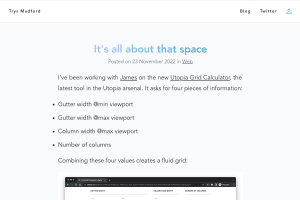
Yet another great Utopia tool, this time for grids, but the right way:
the 12 column grid itself is an illusion, or at best a fading artefact of the emergent design
https:/
Yet another great Utopia tool, this time for grids, but the right way:
the 12 column grid itself is an illusion, or at best a fading artefact of the emergent design
Jen Simmons
,
Saron Yitbarek,
Elika Etemad and
Brandon Stewart
Item Flow, Part 1: A new unified concept for layout
As we worked through the details, we started to get excited. Suddenly new features for Flexbox and Grid that people have wanted for years had an obvious…
Should masonry be part of CSS grid?
An exploration of examples showing masonry as both a part of CSS Grid and as its own display type. Ahmad provides compeling use cases and code examples…
The thing with switching to a new formatting context, as we do with flex and grid layouts, is that the minute you use display: flex or `display:…
Learn Grid Now, Container Queries Can Wait
There’s no rush to rip out all your media queries, and replace them with containers. You’ll be fine waiting for widely available support and your…
I wonder if MDN could add screenshots of the live examples, so people can see the result even if their browser doesn't support a feature yet.
For example for CSS Grid masonry layout:
https://developer.mozilla.org/en-US/docs/Web/CSS/CSS_grid_layout/Masonry_layout
I'm using Firefox, so I had to activate the layout.css.grid-template-masonry-value.enabled flag to see the “good” result.