 Josh W. Comeau
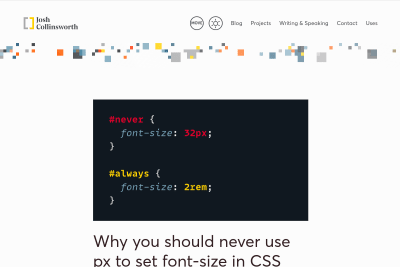
 The Surprising Truth About Pixels and Accessibility: should I use pixels or rems?

https:/
Josh's attention to details in all his articles is awesome. Here, he's presenting evidences that the rem unit should be used for font sizes, media queries and sometimes other dimensions, step by step, with interactive playgrounds.
Nothing new for people who have been advocating for this for years[1], but a great resource for people new to the topic, so thanks a lot Josh! 🙏
There are many quotable contents in Josh's article, but here's one that really resonates with my frequent struggle with people who don't understand that we should work based on available browsing conditions, not devices types and physical dimensions[2]:
A mobile user has less available space than a desktop user, and so we design layouts that are optimized for that amount of space. Similarly, when someone cranks up their default font size, they reduce the amount of available space, and so they should probably receive the same optimizations.
Josh article would be perfect if:
- it also said that browsers' default root font size is not always
16px, this is an urban legend - it also said that Firefox still has a "text only zoom", for site specific root font size adjustment
I tried to help almost 10 years ago (so old that
remwhat something new!) with the talk « Un petit pas pour l’em, un grand pas pour le Web » and the article « Lâchez prise sans perdre le contrôle grâce à l’unité CSS em » (both in French) dedicated to the topic. ↩︎And
viewportwidth and height are only a part of these browsing conditions. ↩︎
 Josh Tumath
 Eric Bailey
 Kathleen McMahon
 Josh Collinsworth