Optical Size tweaking for dark mode
Most type considerations for dark mode are exclusively colour. Changing the foreground and background on a toggle or by the user’s OS preferences.…
There are 33 contents with this tag:
Optical Size tweaking for dark mode
Most type considerations for dark mode are exclusively colour. Changing the foreground and background on a toggle or by the user’s OS preferences.…
The font project is owned by the design system team at IKEA, but working with fonts is quite a specialist skill and we wanted to cast a wide net,…

Never do pixel math with em and rem units. That’s where we went wrong, by assuming that 16px == 1em is a reliable fact. It reminds me a lot…
Web font file size study: a variable font addition
The sum is smaller than the parts. A variable font that has both normal and heavy (bold) weight (and also everything in between) is slightly smaller…
Introducing TODS – a typographic and OpenType default stylesheet
The idea is to set sensible typographic defaults for use on prose (a column of text), making particular use of the font features provided by OpenType.…
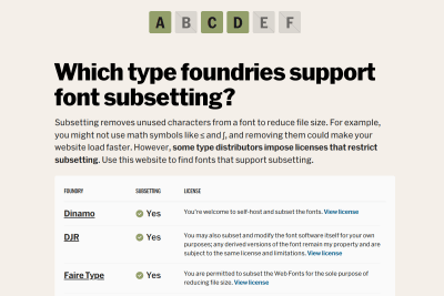
Subsetting.xyz — Type foundries that allow font subsetting
Subsetting removes unused characters from a font to reduce file size. For example, you might not use math symbols like ≤ and ∫, and removing them…

Hardest Problem in Computer Science: Centering Things
Even if it’s hard. Even if tools make it inconvenient. Even if you have to search for solutions. Together, I trust, we can find our way back to putting…
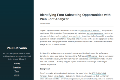
Identifying Font Subsetting Opportunities with Web Font Analyzer
In this article, we’ll explore some potential issues around font loading and the performance benefits of a lesser used feature - font subsetting.…
How many bytes is “normal” for a web font: a study using Google fonts
So here it is, folks, a web font file that supports extended Latin characters, your Às and your Ás and Â, Ã, Ä, Å... should weigh around 20K. Anything…
Seriously?
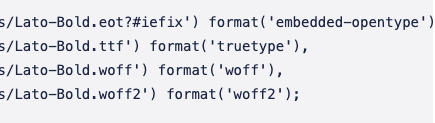
Who still declares font types in the wrong order in @font-face declarations, leading to heavy TTF fonts always loaded? 😭
The Right Way to Use fonts.com Web Fonts
Let’s talk about web fonts. More specifically, about a mistake I have seen developers make in several projects for different agencies: Embedding a…

Richard Ishida
This is a great page on the W3C site showing multiple languages requiring different font styles and fallback. Not everybody has to know all of this,…
Do we really need to repeat that using an icons font is a bad idea?
This is #Mastodon UI right now:
![]()
Fonts are not loaded because of an error (from a Service Worker?):
![]()
Very welcoming for new Mastodon users… 😔
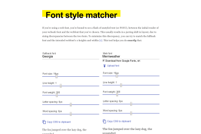
Malte Ubl
a tool that automatically matches the fallback font to the custom font–because computers are good at that stuff. The tool allows you to select every…
Brian Louis Ramirez
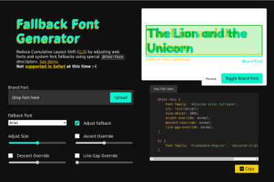
Reduce Cumulative Layout Shift (CLS) by adjusting web fonts and system font fallbacks using special @font-face descriptors.
Seriously, Don’t Use Icon Fonts
I share it now, but Tyler wrote it 7 years ago, and many other said the same, so I really wonder why people keep using icon fonts… 🤦♂️ we need to…
How many times do we have to say it?
Stop.
Using.
Icon fonts.
Seriously, Don’t Use Icon Fonts.
![]()
Here the font request responds with a 503 error (via the Service Worker)…
My photography site is hosted on #Cloudflare, and they transform preload into HTTP/2 push. Great!
But why is my preloaded/pushed font downloaded twice then? 😅
Sara Soueidan
How I set up Glyphhanger on macOS for optimizing and converting font files for the Web
I already had Glyphhanger installed on my computer, but I remember having similar issues, so Sara's article is welcome for anyone who wants to use…
Building a new site with the beautiful Coniferous web font from @OHnoTypeCo and I can't find the right "web safe" fallback font to be able to optimize Cumulative Layout Shifts. 😭
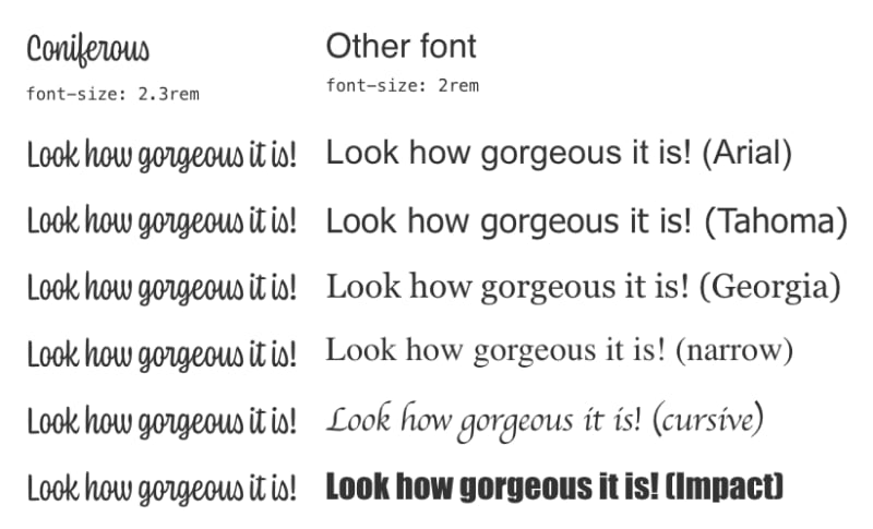
Any suggestion?
Simon Hearne
How to avoid layout shifts caused by web fonts
One common cause of layout shift is surprisingly difficult to resolve though: flashes of unstyled text (FOUT). In this post we will explore the surprisingly…
Romaric Pascal
Adjust font size with CSS custom properties
I do love beautiful Web fonts, even if there are none on this site currently, so I plan to add at least one soon. I might use this nice solution.…
Henry Desroches
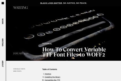
How To Convert Variable TTF Font Files to WOFF2
In previous experience, converting variable TTF to WOFF via online tools like convert.io or FontSquirrel would often break the axes needed to interpolate…
If you're using Google Fonts service instead of self-hosting the fonts (even if they come from Google Fonts), Harry shows here the optimal performance…
Vincent De Oliveira
Deep dive CSS: font metrics, line-height and vertical-align
Line-height and vertical-align are simple CSS properties. So simple that most of us are convinced to fully understand how they work and how to use…
Florens Verschelde
A short history of body copy sizes on the Web
A nice overview of the many variations body copy has seen since the Web exists. I agree with the conclusion: I’m […] sad that we’re somehow chasing…
Jason Pamental
Progressive Font Enrichment: reinventing web font performance
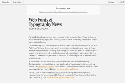
In issue #11 of his great Web Fonts & Typography News newsletter, Jason Pamental shares the progress made by the W3C Web Fonts Working Group towards…
Monica Dinculescu
If you're using a web font, you're bound to see a flash of unstyled text (or FOUC), between the initial render of your websafe font and the webfont…
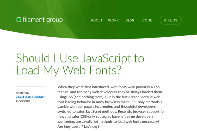
Should I Use JavaScript to Load My Web Fonts?
the advanced web font loading control offered by JavaScript still provides more than sufficient value to keep it around. You can adapt your page’s…
Evan Minto wrote a great article showing the Internet Archive has tested the actual root font-size set by their visitors, and the result shows a lot of people still change the default one: Pixels vs. Ems: Users DO Change Font Size.
People don't change the default 16px font size in their browser (You wish!)
I am really happy to still read articles that advocate for the use of proportional CSS units as em and rem in 2016. But there are often trolls that come comment these articles to say that we, who are using proportional units, are dumb, because there is no need for this. Here is an example. There are unfortunately two misleading urban legends in most web developers minds. I often call myself a troll, that's not that harsh when I'm the one saying it… 😉
De nouvelles fontes sur Gastero Prod
Navigant régulièrement avec une connexion de piètre qualité, j'en ai un peu marre de voir de nombreux sites me présenter juste des éléments d'interface…
Vous l'avez peut-être remarqué vous même si vous faites partie des rares à venir de temps en temps sur le site, mais certainement pas si vous me lisez…
See all tags.