Shubham Bose
Good UX is highly desired and once you get it right, it feels almost natural, intuitive. The current state of news UI assumes that the reader is an…
There are 66 contents with this tag:
Shubham Bose
Good UX is highly desired and once you get it right, it feels almost natural, intuitive. The current state of news UI assumes that the reader is an…
let’s make software that respects your attention, does its job well, and lets you get on with your life. That’s what good software used to feel like…
In the economy of user effort, be a bargain, not a scam
Treat user effort as a currency. To create a product users love, design the tradeoff curve of use case complexity to user effort with the same care…
Apple's first desktop operating system was Tahoe. Like any first version, it had a lot of issues. Users and critics flooded the web with negative…
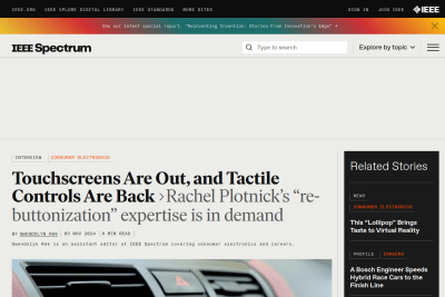
Gwendolyn Rak
Tactile Controls: Why Buttons Are Making a Comeback
When I’m driving, it’s actually unsafe for my car to be operated in that way [with a touchscreen]. It’s hard to generalize and say, buttons are always…
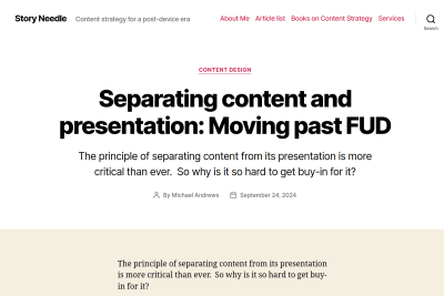
Michael Andrews
Separating content and presentation: Moving past FUD
The biggest barrier to the universal adoption of content-presentation separation is poor implementation. Bad tools, weak requirements, and immature…
Please, please, please… check on the sites you build that using Command #fn1" id="fnref1">[1] + click #fn2" id="fnref2">[2] always opens links in a new tab, even if you used some JavaScript to build a dumb Web link!
I see too many sites where Cmd + click opens the link in the current tab, so when browsing a list of links, if I want to open them in new tabs (for example to compare products), I need to use right click and then select the "open link in a new tab" option, for each link.
Really cumbersome! 😡
Arguments for opening links in a new tab or window
A significant percentage of web professionals believe that opening outbound links in new tabs or windows provides a benefit to site owners. Why? Is…
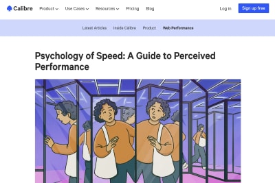
Psychology of Speed: A Guide to Perceived Performance
When people mention web performance, they usually focus on development-first aspects like JavaScript frameworks and performance metrics. These are…
Kuba Bartwicki and Monica Crusellas
A bold new look for the GOV.UK homepage
we’ve made the design of the homepage bolder and clearer on mobile devices. We redesigned the header area and increased font sizes and spacing throughout…
Midnight is a Terrible Time for Coffee
It’s easy to assume that folks won’t use the defaults, but some will (intentionally or accidentally.) By improving these defaults, you improve the…
It's pretty annoying to see the same toot repeatedly on #Mastodon because everyone is boosting it, even if it's legitimately awesome.
Currently, a boost of a toot is only posted if at least 40 other toots have been posted since the previous boost of the same toot.
There is a GitHub issue asking to allow the user to change this number, or set a duration instead:
https://github.com/mastodon/mastodon/issues/18693
Please vote!
Navigation doesn’t have to be hidden behind a "Menu"-button. If it matters, we need to show it, and do so prominently. Some items are more important or more frequently used, so they might deserve a little bit more spotlight in your navigation.
In addition to prominent navigation options @vitalyf shows in his thread, I really like the horizontal overflow scrolling navigation, enhanced with @LeaVerou's scrolling shadows.
Do we really need to repeat that using an icons font is a bad idea?
This is #Mastodon UI right now:
![]()
Fonts are not loaded because of an error (from a Service Worker?):
![]()
Very welcoming for new Mastodon users… 😔
Stéphanie Walter
A Designer’s Guide to Documenting Accessibility & User Interactions
A lot of sites were not designed and developed with accessibility needs in mind. As designers, a lot of us think that “accessibility is the job of…
Jenni Nadler
When life gives you lemons, write better error messages
Wix reviewed and fixed 7,643 error messages that were “generic” or “not helpful”, and Jenni explains how to provide better assistance to users: What…
There's a nice little easter egg on @letterboxd's page for the awesome Everything Everywhere All at Once movie.
But you can only see it when you've seen the movie! 😅
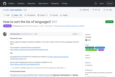
Richard Ishida
How to sort the list of languages?
When asked about how to sort languages for the W3C site redesign, Richard made a great detailed answer, with a nice focus on user needs: Sorting by…
You can now filter the tags by usage frequency! 🏷🏷🏷
Can you guess which are my favorite topics? 😅

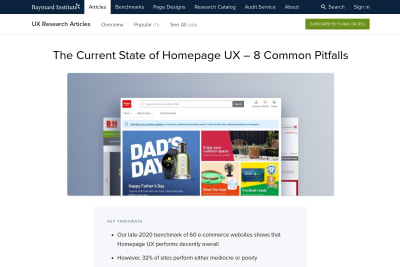
Baymard Institute
The Current State of Homepage UX – 8 Common Pitfalls
while the homepage may not be the predominant entrance path it once was […], it still serves a central role as an anchor for the site’s category taxonomy,…
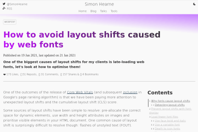
Simon Hearne
How to avoid layout shifts caused by web fonts
One common cause of layout shift is surprisingly difficult to resolve though: flashes of unstyled text (FOUT). In this post we will explore the surprisingly…
I just added buttons to quickly access previous and next content on large viewports.
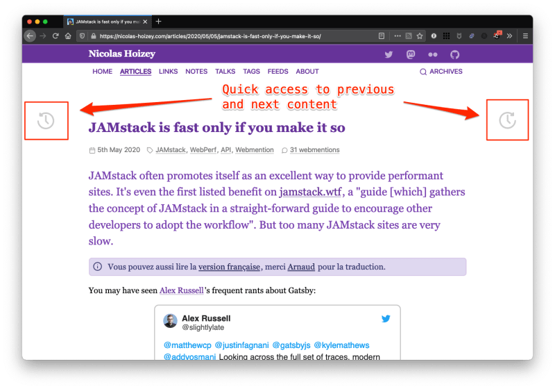
Now I wonder how to make them accessible, and how to show them on narrow viewports.
Jakob Nielsen
10 Usability Heuristics for User Interface Design
Jakob Nielsen's 10 general principles for interaction design. They are called "heuristics" because they are broad rules of thumb and not specific…
Tim Kadlec
When the skeleton screen doesn’t match the outcome, we’ve created confusion and frustration that will overcome any benefit you might have gotten from…
Enhancing archives navigation, step 2
In my previous article Enhancing archives navigation, step 1, I promised further archives navigation enhancements. Here they are!
Enhancing archives navigation, step 1
I decided years ago to remove paged navigation (aka "pagination"), because I find it not user friendly at all, and a nightmare for SEO with new content pushing one tenth of contents to another page (for a 10 items per page pagination). Now, I improved the UX even further.
Stéphanie Walter
Enhancing User Experience With CSS Animations
Another amazing resource from Stéphanie, a detailed transcript of a talk she gave for Shift Remote. With CSS and JS progress, implementing animations…
Christian Holst
4 Design Patterns That Violate “Back” Button Expectations – 59% of Sites Get It Wrong
The consequences of breaking the user’s expectations of how the browser “Back” button should behave can be dire. During our usability tests, it has…
If iTunesMusic plays in the background, there is a media control key in the Touch Bar.

This key shows the media controls.

When Music is in focus, there is another Touch Bar.

The control keys and the progress bar are inverted! 🤦♂️
I wish #GitHub had a different UX for repository deletion if this is a fork.
Especially if there is nothing useful (no open PR for example) on the repository to delete. "Unexpected bad things" will NOT happen in such case!
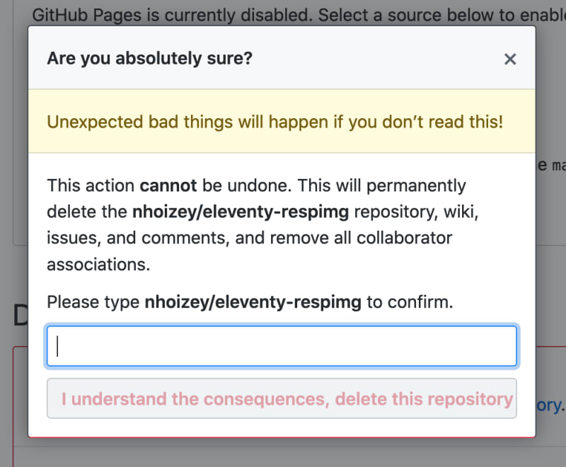
(sorry @etportis 😉 )

We have to stop confusing the excesses of capitalism with the hallmarks of quality. Sometimes Google aren’t better, they’re just more pervasive.
Stéphanie Walter
The Ultimate Guide to Not Fucking Up Push Notifications
Awesome article about everything you have to take into consideration when planning to use Push notifications. For the sake of ** sick ** growth hacking,…
We’re bombarded by more information than ever before. With the rise of all this information comes a rise of the amount of bullshit we’re exposed to.…
Adrian Zumbrunnen
Creating distraction-free reading experiences
Distractions have always been a natural constituent of our lives. But with the rise of mobile technology, a circus of notifications, and all the noise…
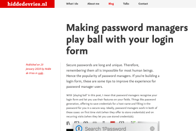
Hidde de Vries
Making password managers play ball with your login form
Password managers are essential to secure internet usage, so making our login fields work with them is extremely important. This will mostly happen…
Soignez votre lisibilité avec des textes de largeur maîtrisée
Afin d'assurer une présentation optimale du texte pour la lisibilité, il est nécessaire de définir un nombre optimal de caractères par ligne quelle que soit la taille du texte.
Laisser les champs mot de passe en clair
J'avais découvert chez Luke Wroblewski que la galère historique des mots de passe masqués dans les champs de formulaires Web n'est pas une fatalité,…
Le Firefox de mon MacBook Pro HD est configuré avec une taille de texte par défaut de 18px. Sur mon Mac mini branché à la TV de mon salon, c’est 24px.…
Performance Web, ma conférence à Web UX
Pour ceux qui n'étaient pas présents à Web UX en mai 2011, et avec pas mal de retard, voici mes slides, ainsi que la vidéo captée par l'équipe organisatrice.…
Retrouvons nous à Web UX et Sud Web les 26 et 27 mai
Vous le savez sans doute si vous me lisez régulièrement, sur ce blog ou via mes tweets, je suis dingue de Web, et toujours intéressé par ses moyens…
La navigation ne se fige plus en haut de l'écran lors du scroll
Vous l'avez peut-être constaté par vous-même, le menu de navigation de ce site ne se fige plus en haut de l'écran quand vous descendez dans la page.…
Quand Mozilla pose une question à son utilisateur, ce n'est pas pour qu'il fasse un choix…
Je me suis enfin décidé à faire un peu de ménage dans mes collections d'extensions Firefox, et quand j'ai voulu supprimer les collections résiduelles,…
Des facettes de recherches inexploitables sur 01net.com
La recherche par facettes est très tendance en ce moment, et à raison, puisqu’elle aide vraiment les utilisateurs à préciser leurs recherches en ayant…
Donner des noms explicites aux fichiers en téléchargement
De nombreux sites proposent de télécharger des fichiers. Qu’il s’agisse de documents bureautiques, de programmes ou de tout autre format, le nom du…
Des noms de fichiers à télécharger dénués de sens sur software.canon-europe.com
Je défie quiconque normalement constitué de s’y retrouver après avoir téléchargé plusieurs fichiers sur le site de support logiciel de Canon Europe.…
Un tri incompréhensible des fuseaux horaires sur txtst.com
La géolocalisation est un service de plus en plus tendance, notamment au sein des applications Web sociales. La solution Fire Eagle de Yahoo! permet…
Utiliser un tri significatif dans les listes
On nous propose parfois dans des formulaires de faire un choix dans une liste pour sélectionner une option. Selon la nature de l’information listée,…
Des formulaires qui n’en ont pas l’air sur moof.com
Moof est une n-ième application Web d’écoute de musique, mais je ne m’étendrais pas sur les fonctionnalités, là n’est pas le sujet. Une originalité…
L’innovation, ça a du bon, ça fait avancer. Mais à trop innover, on perd les utilisateurs en chemin, parce qu’on leur impose de nouvelles choses qui…
Citation d'Antoine de Saint-Exupéry
La perfection, ce n’est pas quand il n’y a plus rien à ajouter mais plus rien à supprimer.
Le design de Gastero Prod est-il à jeter à la poubelle ?
Alarmé par certains commentaires faits sur Twitter par des personnes dont l'avis m'intéresse particulièrement, je me rends compte que ce que je considère…
Un menu de navigation toujours visible
Depuis quelques jours, le menu de navigation principal de Gastero Prod reste visible en permanence même si vous descendez dans la page. Cela peut…
Citation de Robert Hoekman, jr.
The application itself is not a goal at all, it's an obstacle between the user and their goal. Traduction : L'application n'est pas du tout un but,…
En ergonomie, le choix des bons symboles est primordial
Si vous devez opter pour des métaphores visuelles pour représenter des données ou des actions réalisables, faites bien attention à ne pas laisser…
Les carrousels en 3D sont à la mode
J'ai vu apparaître ces derniers jours des carrousels en 3D sur les pages des sites de vente en ligne Amazon et Alapage, drôle de coïncidence ! D'après…
Certain(e)s d'entre vous préfèrent lire les commentaires sur les articles par ordre chronologique, comme c'est obligatoirement le cas avec certains…
Ergonomie à revoir : Clio Renault Sport
Bon, là je sais, on va me dire que je suis trop perfectionniste, que ça frise le harcèlement, mais que voulez-vous, il y a des choses qu'il serait…
Ergonomie à revoir : Inscription pour Apple Expo 2007
Décidément j'ai du mal avec les formulaires d'inscription, avec cette fois-ci celui pour obtenir un badge pour la prochaine Apple Expo à Paris. Je…
La société SOA Software, comme son nom l'indique, est un éditeur de logiciel appartenant à la grande tendance SOA actuelle. Mais peut importe, les…
Je suis tombé dernièrement sur un four imaginé par Rowenta qui m'a un peu surpris. Je dis bien «imaginé», parce que je n'ai jamais rien vu de semblable.…
Ergonomie à revoir : CashStore.fr
A priori, avant même de penser à ses contenus et à leur présentation, il n'est pas franchement difficile de suivre quelques règles simples d'ergonomie…
Est-il utile de mettre à disposition des archives par date de publication ?
Sur Gastero Prod, les archives des contenus publiés depuis le premier article du 21 janvier 2001 sont bien entendu accessibles via le moteur de recherche…
Un problème d'ergonomie chez les petits Swiss
Le site de la compagnie aérienne suisse Swiss International Airlines présente un défaut d'ergonomie bien incompréhensible au niveau de la sélection…
See all tags.
