Christian Holst avatar Christian Holst

4 Design Patterns That Violate “Back” Button Expectations – 59% of Sites Get It Wrong

Screenshot of “4 Design Patterns That Violate “Back” Button Expectations – 59% of Sites Get It Wrong”

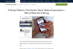
The consequences of breaking the user’s expectations of how the browser “Back” button should behave can be dire. During our usability tests, it has been the direct cause of abandonment, with users leaving test sites with much swearing and cursing (even from the calmer test users).

Could have been me, I do leave many sites miss-behaving with back buttons on mobile…


  1. Navigation doesn’t have to be hidden behind a "Menu"-button. If it matters, we need to show it, and do so prominently. Some items are more important or more frequently used, so they might deserve a little bit more spotlight in your navigation.

    In addition to prominent navigation options @vitalyf shows in his thread, I really like the horizontal overflow scrolling navigation, enhanced with @LeaVerou's scrolling shadows.