Baymard Institute avatar Baymard Institute

The Current State of Homepage UX – 8 Common Pitfalls
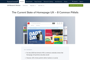
Screenshot of “The Current State of Homepage UX – 8 Common Pitfalls”

while the homepage may not be the predominant entrance path it once was […], it still serves a central role as an anchor for the site’s category taxonomy, and an escape route — a place to refer back to throughout the shopping session.

And yet, we struggle daily with most website… 😭

  1. Navigation doesn’t have to be hidden behind a "Menu"-button. If it matters, we need to show it, and do so prominently. Some items are more important or more frequently used, so they might deserve a little bit more spotlight in your navigation.

    In addition to prominent navigation options @vitalyf shows in his thread, I really like the horizontal overflow scrolling navigation, enhanced with @LeaVerou's scrolling shadows.