Heydon Pickering avatar Heydon Pickering

The Flexbox Holy Albatross Reincarnated
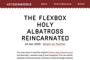
Screenshot of “The Flexbox Holy Albatross Reincarnated”

when you have three items, you’ll be happy with the three-abreast layout and accepting of the single-column configuration. But you might like to avoid the intermediary part where you get a pair of elements on one line followed by a longer element underneath.

A great responsive layout trick, without any Media Query, so also usable inside a component of any width, awesome!

As mentioned in Heydon's post, Rémi Parmentier already wrote 3 years ago about his Fab Four technique to create Responsive Emails without Media Queries, but I like how Heydon uses custom properties to make it easier (Yes, Remi could obviously not have used them back then.)

We still do need container/element queries, anyway, for other responsiveness needs!
  1. Note from 24 May 2023

    Do you know good tutorials and/or examples about dealing with responsive images that are fluid horizontaly, but with a fixed height?

    Using object-fit: cover; in the CSS is easy, but how can we prevent loading many pixels that will be hidden, without using too many <source> in a <picture>?

  2. Note from 16 December 2022

    While we wait for browsers to implement the text-wrap: balance; #CSS property and value for text (pleeeeeease! 🙏), I may have created a silly — and probably sub-optimal — function to do it with HTML block elements:

    https://codepen.io/nhoizey/pen/mdjbrVx

    Tell me what you think!

    But why? Just because a colleague needed it, we could not find a solution in pure CSS, and I like challenges… 😅