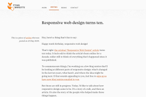
Responsive web design turns ten
https:/
I remember being really excited when I read Ethan's Responsive Web Design article on A List Apart and saw the final responsive result.
10 years later, a lot have changed in Web pages layouts thanks to new capabilities in CSS with Flexbox and Grid, allowing us to design responsive sites without any Media Query:
Pack11ty's design is responsive without any Media Query's design is responsive without any Media Query Screenshot of Pack11ty design in multiple devices/viewports](https://res.cloudinary.com/nho/image/fetch/q_auto,f_auto,w_auto:100:800,c_limit/https%3A%2F%2Fnicolas-hoizey.com%2Flinks%2F2020%2F05%2F26%2Fresponsive-web-design-turns-ten%2Fpack11ty-responsive-without-media-query.png)
But the most important part of Ethan's idea of Responsive Web Design is not about the technical implementation, it's about embracing the flexibility of the Web material.
A light went off in my head. Responsive felt right for what I was trying to describe: layouts that would just know the best way to fit on a user’s screen. A user wouldn’t have to tap or click on anything to get the best design for their laptop or smartphone; rather, the design could fluidly adapt to the space available. It’d just respond.
