When we say "truncation is not a content strategy", it's true also for design tokens names!
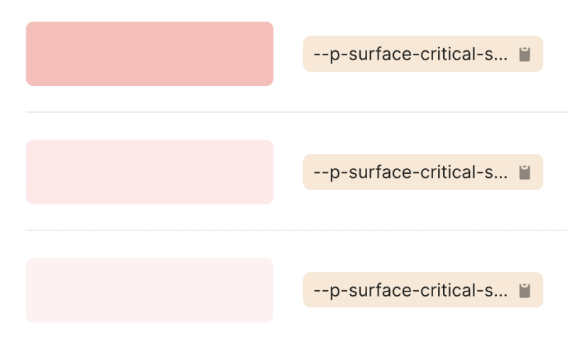
I saw this is Shopify's Polaris Design System… 🤷♂️
When we say "truncation is not a content strategy", it's true also for design tokens names!
I saw this is Shopify's Polaris Design System… 🤷♂️
I'm still looking for an alternative to Forestry:
https://forestry.io/blog/tina-cloud-the-next-forestry/
As Netlify doesn't seem to care for Netlify CMS anymore:
https://answers.netlify.com/t/is-this-project-dead/70988/1
A fork managed by a community might be a good solution, I'll keep an eye on it:
https://staticjscms.netlify.app/
My notes will now be push to Mastodon as toots, this feels great! 🎉
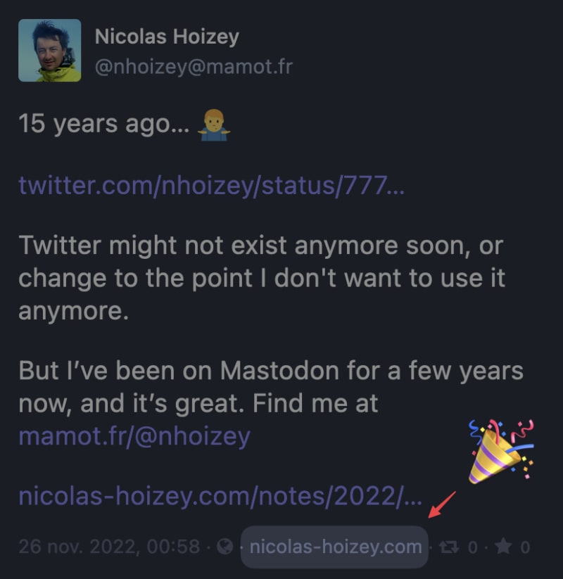
15 years ago… 🤷♂️
Work, what else?
Twitter might not exist anymore soon, or change to the point I don't want to use it anymore.
But I’ve been on Mastodon for a few years now, and it’s great. Find me at https://mamot.fr/@nhoizey
I'm trying to use #Leonardo to create a real set of design tokens for the colors I currently use on https://nicolas-hoizey.photo but I didn't find how to set the background color to #292929 instead of white… 🤷♂️

Navigation doesn’t have to be hidden behind a "Menu"-button. If it matters, we need to show it, and do so prominently. Some items are more important or more frequently used, so they might deserve a little bit more spotlight in your navigation.
In addition to prominent navigation options @vitalyf shows in his thread, I really like the horizontal overflow scrolling navigation, enhanced with @LeaVerou's scrolling shadows.
Do we really need to repeat that using an icons font is a bad idea?
This is #Mastodon UI right now:
![]()
Fonts are not loaded because of an error (from a Service Worker?):
![]()
Very welcoming for new Mastodon users… 😔
TIL @media not (min-width: 60rem) { … } doesn't work in Safari, while it works in Chromium and Firefox.
Safari requires a media type, like all.
So here's the "right" syntax:
@media not all and (min-width: 60rem) { … }

