 Ethan Marcotte
 It’s not about the device.
https:/
I generally avoid terms like “mobile”, “tablet”, and “desktop” in my work. It’s not that they’re bad; it’s because they’re broad. In my experience, terms like these confuse more than they clarify.
https:/
I generally avoid terms like “mobile”, “tablet”, and “desktop” in my work. It’s not that they’re bad; it’s because they’re broad. In my experience, terms like these confuse more than they clarify.
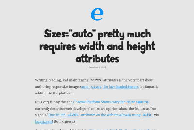
Sizes="auto" pretty much requires width and height attributes
sizes="auto" is a great new feature of HTML for lazy loaded responsive images. are we dealing with an with sizes=auto? Then its natural dimensions…
Kuba Bartwicki and Monica Crusellas
A bold new look for the GOV.UK homepage
we’ve made the design of the homepage bolder and clearer on mobile devices. We redesigned the header area and increased font sizes and spacing throughout…
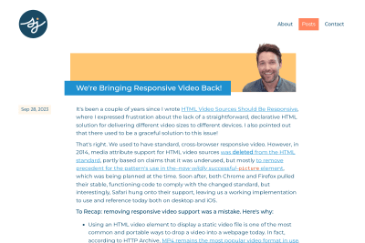
We're Bringing Responsive Video Back!
Responsive videos with simple HTML and no JS! 😍 Hopefully, this patch will show up in an upcoming Firefox release! 🤞
Educational Sensational Inspirational Foundational
A historical record of foundational web development blog posts. I've already read most of these great articles, and will of course read the few missing.…
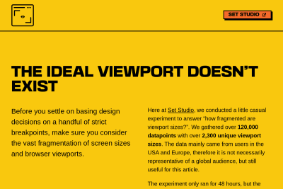
The ideal viewport doesn’t exist
you simply do not know how users are going to visit your website or web app. Instead of making design decisions on strict, limited breakpoints, keep…
 Eric Portis
 Scott Jehl
 Zach Leatherman