Jump to main content

Nicolas Hoizey

  • articles
  • billets
  • links
  • notes
  • talks
  • archives
  • about

Matt Anderson

Don't design for mobile
  • Nicolas Hoizey
  • 1 September 2020
  • responsive, mobile, progressive enhancement
  • 4 reactions
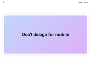
Screenshot of “Don't design for mobile”

https://mattanddesign.com/dont-design-for-mobile/

as the device landscape continues to converge, the categorizations will continue to blur. And as you introduce more interactivity and complex features to your site, the singular approach starts to break down.

4 reactions

3 likes

  1. myf avatar
  2. Greg Ives avatar
  3. Maëlig avatar

1 repost

  1. spipfactory.fr avatar
  • Older: RFC8890: The Internet is for End Users
  • Newer: Are Your Country’s Cellphone Plans a Rip-off?

Related contents with similar topics

  1. Note from 24 May 2022

    • Nicolas Hoizey
    • 24 May 2022
    • mobile, responsive
    • 20 reactions

    Is there any public data about most common viewport widths and screen densities on the Web?

    I have screen resolutions on StatCounter — good enough proxy for viewports? —, but nothing for screen densities… 🤨

  2. Viewport height is taller than the visible part of the document in some mobile browsers

    • Nicolas Hoizey
    • 18 February 2015
    • CSS, viewport, responsive, 100vh, bug, mobile
    • 253 reactions

    When trying to use a 100vh CSS value to build a new interface for a game that would use the full viewport, I discovered that this full height value…

If you want to share an error or suggest an enhancement of this content, please edit the source on GitHub.

© Nicolas Hoizey

Built with Eleventy