Listen To Me And Not Google

https:/
We have to stop confusing the excesses of capitalism with the hallmarks of quality. Sometimes Google aren’t better, they’re just more pervasive.
https:/
We have to stop confusing the excesses of capitalism with the hallmarks of quality. Sometimes Google aren’t better, they’re just more pervasive.
Gwendolyn Rak
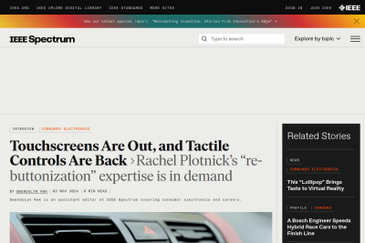
Tactile Controls: Why Buttons Are Making a Comeback
When I’m driving, it’s actually unsafe for my car to be operated in that way [with a touchscreen]. It’s hard to generalize and say, buttons are always…
Arguments for opening links in a new tab or window
A significant percentage of web professionals believe that opening outbound links in new tabs or windows provides a benefit to site owners. Why? Is…
Stéphanie Walter
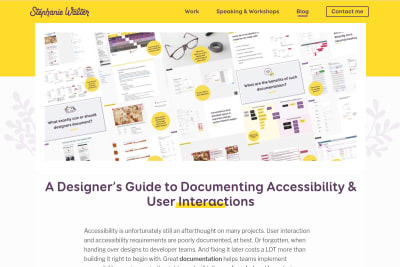
A Designer’s Guide to Documenting Accessibility & User Interactions
A lot of sites were not designed and developed with accessibility needs in mind. As designers, a lot of us think that “accessibility is the job of…
I just added buttons to quickly access previous and next content on large viewports.
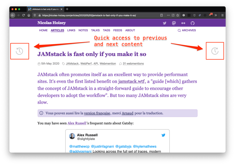
Now I wonder how to make them accessible, and how to show them on narrow viewports.
Soignez votre lisibilité avec des textes de largeur maîtrisée
Afin d'assurer une présentation optimale du texte pour la lisibilité, il est nécessaire de définir un nombre optimal de caractères par ligne quelle que soit la taille du texte.